
Article
What should buyers know first?
Short answer: A practical B2B guide to turning rich rust into a controlled apparel colorway through fabric selection, palette roles, samples, components, private-label details, and bulk-release records.
What does rich rust mean in fashion?
Rich rust in fashion is a deep, warm color direction that usually sits between red-brown, clay, copper, tobacco, brick, and softened burnt orange. It can feel grounded without reading flat, which makes it useful for fashion buyers building dresses, blouses, relaxed tailoring, overshirts, knitwear, trousers, outer layers, loungewear, and small private-label capsules. The name alone is not a production instruction. A rust direction can look redder on one fabric, browner on another, and considerably brighter or duller under a different finish, wash, or light.
For an apparel buyer, the commercial question is therefore not whether rust looks seasonal on a mood board. It is which exact rust direction belongs in the range, what job it performs, which materials and components must support it, and what evidence will control the final decision. A good color brief lets a factory distinguish a visual starting point from a fabric-and-garment route that can be reviewed, approved, and repeated.
Yinshan Fashion supports custom and private-label bulk programmes rather than unrestricted ready-stock wholesale. A useful rich rust brief can begin with a reference image, but it should also state the target wearer, product categories, intended fabric behavior, colour role, related shades, construction or decoration details, label and packing needs, sample objective, quantity structure, destination, and open decisions. A photograph can show mood, proportion, styling, and color contrast. It cannot by itself confirm material availability, a dye method, price, testing outcome, or delivery commitment.
The practical route is to name the desired rust direction, give it a clear product role, prove it on the chosen material route, assess it beside visible components, approve the evidence for the stated scope, and retain that decision through bulk and repeat orders. That is how an earth-tone reference becomes a usable apparel colorway.
Why does rich rust need a buyer decision before sampling?
Rich rust can be interpreted in many ways. One brand may mean a dry brown-red twill suited to a utility overshirt. Another may mean a softened clay knit for a lounge set. A third may want a saturated copper accent in a print, lining, woven label, or embroidered detail. If the buyer gives only the word “rust,” the development team must guess the undertone, depth, surface, product role, and acceptable variation. That can create a sample that looks attractive but answers the wrong product question.
Start by recording what cannot change. The buyer may be fixed on a warm red-brown direction, a low-sheen surface, and an autumnal role beside cream and charcoal. They may be flexible on the exact fibre route, shade depth, or whether rust appears across two core styles or as a limited colorway. Separating fixed decisions from open questions gives the supplier a useful frame for sourcing, sampling, and factory coordination.
Also define the collection role. Rust can be a body color that carries an entire dress, trouser, shirt, knit, or jacket. It can be a supporting color that connects a light neutral with deep blue or green. It can be a lower-risk accent in piping, a pocket panel, a contrast collar, a print ground, embroidery, rib, lining, drawcord, label, or packaging detail. Each role exposes different quantities of fabric and different color-control risks. The brief should name the role by style rather than applying one broad palette word to every item.
How should buyers define rich rust without relying on a screen?
Use a working description that explains the target direction in practical language. Record whether the rust should lean more red, brown, orange, or muted clay; whether it should feel dark, middle-depth, dusty, dry, soft, dense, or luminous; and whether surface texture is part of the intended result. Add the source reference, date, image purpose, material scope, reviewer, and one explicit question for the next proof.
For example, “retain a deep brown-red direction with a dry, low-sheen surface on the selected twill” gives a clear review question. “Use rich rust” does not. A buyer can also note what the color must avoid: too orange beside cream, too red under store lighting, too brown on a light jersey, or too dark once a wash and charcoal components are applied. These observations are not technical specifications by themselves, but they make later sample comments more useful.
Keep the visual reference separate from the controlling production reference. A supplied editorial image can explain styling, hierarchy, and the relationship between a rust garment and its surroundings. A fabric swatch, physical color standard, retained garment, Lab Dip, strike-off, or approved sample may control a narrower decision only when the buyer identifies it as such. The apparel color palette planning guide can help teams organise those sources into color roles, proof stages, and dated decisions.
Screens deserve a separate caution. Display settings, exposure, compression, surrounding colors, and ambient light can change the apparent balance of a warm shade. A screenshot may be a valuable starting point, but it should not silently become the bulk standard. Ask what the image is meant to communicate and what needs to be checked on the intended physical material.
How does fabric behavior change a rich rust colorway?
Fabric surface changes the color that a buyer sees. Fibre content, yarn, weave or knit construction, weight, density, texture, opacity, sheen, dye route, wash, coating, print method, and finish can all shift rich rust. A dry cotton twill can make the same direction feel earthy and structured. A brushed fleece may soften its edge. Rib knit can create shadow that deepens it. A smooth compact jersey can look cleaner and more even. A satin-like woven can make a restrained clay direction appear brighter or redder. A wash may create tonal movement that does not appear in an untreated swatch.
This is why color and material should be reviewed together. Before a buyer approves a direction, they should identify what the fabric must do in the garment: hold a tailored line, drape softly, recover in a knit, support a gathered sleeve, remain opaque in a light area, carry a print, or survive an intended wash. The fashion clothing fabric selection guide is a useful way to connect these behavior questions with the color route.
The relationship is especially important for rich rust because “depth” can come from texture as much as pigment. A rougher, brushed, woven, or ribbed surface may create the dense earth-tone impression a buyer wants. A very flat or glossy surface may make the same hue read as a different commercial family. Do not choose texture merely to make a color look premium. Name the intended product, comfort, construction, price direction, and retail use, then decide whether the surface supports all of those aims.
Which colors should sit beside rich rust in an earth-tone collection?
Useful rich rust pairings often include cream, oat, parchment, soft grey, stone, dark brown, charcoal, washed black, deep ocean blue, muted sage, and peacock green. The right pairing is not a universal palette recipe. It depends on which item carries the rust, which element carries the companion color, the ratio between them, the fabric surfaces involved, and the sales role of the finished garment.
Cream can clarify a dark rust body and make it feel lighter in product photography. Brown can create a tonal, layered look but needs enough separation in depth or texture to avoid looking accidental. Charcoal can add structure without the stark contrast of black. Deep blue can make rust feel warmer and more mature. Muted green can add a natural counterpoint, while peacock green creates a stronger jewel-tone contrast. A buyer should describe which relationship is intentional: exact matching, tonal coordination, clear contrast, or an acceptable difference.
Assign the pairing to actual products. A cream collar or facing has a different exposure from a cream knit styled beside a rust trouser. A dark brown button can make a rust shirt look grounded; the same brown in a lining may be almost invisible. A deep blue garment placed beside rust in a campaign photo is different from deep blue zipper tape on the garment itself. The style-color-material matrix should make these roles visible before component sourcing or product photography begins.
The deep ocean blue guide can help buyers define a colder palette partner without treating it as an automatic approval. A future peacock-green route can add a stronger jewel-tone contrast, but buyers should review the exact garments and visible components together before making any bulk decision.
How can rich rust work across dresses, blouses, and casual fashion?
Rich rust can carry a fitted woven dress, a relaxed shirt dress, a soft blouse, a tailored trouser, a boxy overshirt, a knit layer, a hoodie, or a lounge set. The relevant question is what the color needs to emphasize. On a dress, rust can support a defined waist, a draped skirt, a structured collar, a print ground, or a soft lining relationship. On a blouse, it may work through flow, opacity, neck detail, cuff construction, and the way the fabric sits beside hardware or buttons. On casual fashion, it can ground a collection of jersey, fleece, twill, denim-adjacent fabrics, and outer layers.
Start with a small, legible set of applications. A buyer might use rust as a core body color on a woven overshirt and dress, then use it only as a print or label detail on a related knit. Another range may use rust as a limited blouse and trouser colorway while relying on neutrals for the rest of the capsule. The objective is not to put the shade on every possible garment. It is to give the buyer and factory a manageable number of style-color-material routes to prove and release.
Use the product category to identify risk. A draped rust dress may need attention to opacity, lining, neckline stability, seam balance, and hem movement. A rust shirt may need clean placket, collar, button, pocket, and cuff decisions. A washed casual layer may need a review of how wash and construction create tonal variation. A knit may need color approval alongside stretch, recovery, rib, and component behavior. A good manufacturer asks which product questions are most important before treating color as a separate department.
How should prints, embroidery, and texture use rich rust?
Rich rust does not need to be a solid body color. It can provide warmth in a floral, geometric, stripe, placement print, jacquard, embroidered element, woven label, patch, piping, contrast panel, or lining. These routes should still be planned as product decisions because ink, thread, ground fabric, coverage, scale, placement, backing, curing, wash, and the surrounding colors can all change the final impression.
For a print, record the artwork version, intended ground fabric, color list, scale, placement, coverage, and the proof needed next. A digital file can show the visual intention but not necessarily the result on a textured woven, a rib knit, or a washed jersey. For embroidery, name the thread reference, density, backing, fabric compatibility, and whether the rust is meant to match the body, coordinate tonally, or remain visibly distinct. For a jacquard or textured knit, make sure the buyer understands that stitch and surface shadows may create part of the visual depth.
Use proof stages proportionately. A small interior label may only need a controlled artwork and material review. A high-coverage print ground or contrast embroidery on a body color may need a strike-off or applied garment review. The record should state what each proof establishes and what still needs a sample. This helps prevent a beautiful digital reference from becoming an unintended production standard.
Why do trims, labels, and packing matter to a rust garment?
The body fabric is only one part of the visible result. Thread, zipper tape, buttons, snaps, elastic, drawcords, rib, lining, facings, labels, hangtags, polybags, stickers, cartons, and shipping marks can either support or weaken an earth-tone direction. A buyer should map the items with the greatest visual exposure and name the required relationship: exact match, tonal coordination, contrast, neutral support, or separate proof.
Private-label details should stay attached to the current style-color-material version. A dark woven label may make a rust neckline read deeper. A cream printed neck label may create a cleaner impression. A bright hangtag, bag, or photo background can shift the way the product is perceived before a buyer sees the garment. The private-label page is a useful starting point for organising brand artwork, care and composition inputs, labels, barcodes, and packing decisions around the actual product route.
Keep the review proportional. A small internal care label may not require the same review as a visible contrast rib, branded embroidery, large button, full lining, or high-exposure print. What matters is that the team records which parts must align with the rust direction and which differences have been deliberately accepted.
What should a rich rust sample prove before bulk production?
A sample should answer a stated product question. For color development, that may be whether the selected material achieves the intended undertone and depth; whether the fabric surface supports the desired earth-tone effect; whether rust works beside a lining, rib, button, print, or label; or whether construction and wash shift the result beyond what the buyer intended. The first sample is not simply an image for marketing. It is evidence for the next decision.
Record the sample version, fabric and trim references, current measurements where fit matters, construction route, material or color observations, reviewer, decision owner, approved points, remaining questions, and next action. A Lab Dip can be useful for a stated color question on a named base fabric, but it does not automatically approve another fabric, wash, print, component, or complete garment. A garment sample may still be needed when fit, construction, finish, or visible components affect the color impression.
Yinshan Fashion can coordinate a sample route around a buyer's reference, product category, fabric direction, color role, components, and approval goal. The current sample policy should be confirmed with the project quotation: sample garments are generally quoted at two to three times the corresponding bulk garment price, and sample-charge refunds can be tied to the order quantity for the same style. This commercial framework does not replace a project-specific confirmation of the product, fabric, construction, quantity, and order terms.
The fashion sample approval guide explains how sample evidence should connect to materials, fit, trims, labels, packing, and bulk-release records. Keep all comments versioned so a later change does not overwrite what an earlier sample actually proved.
How should buyers protect rich rust through bulk and repeat orders?
Bulk color control is a documented process, not a promise that every garment will look identical under every kind of light. The relevant checks depend on the garment, fabric, dye or print route, shade depth, components, wash, quantity structure, and buyer requirements. Ask where the accepted reference is held, which style-color-material combinations it controls, when comparison occurs, how a finding is recorded, and who can approve a relevant change.
The release pack should connect the style code, color code or description, material and component references, approved proof, construction points that affect appearance, sample comments, labels, packing, quantity structure, quality priorities, accepted exceptions, and authorised changes. A buyer need not turn every project into an oversized document. The aim is to make the current product version usable for the team responsible for cutting, sewing, finishing, checking, packing, and export preparation.
For a repeat order, start with a difference list. Confirm what remains the same and what has changed: fabric availability, yarn or base, finish, dye route, wash, trim source, lining, label package, packing, size mix, destination, or quality priorities. A prior rust sample is useful history, but it should not be treated as automatic approval for a changed route. This discipline protects both the buyer and the factory from relying on memory.
How should product photography support, rather than replace, color approval?
Rust is often judged online before a buyer touches the garment. Product imagery can show silhouette, material mood, styling, texture, and the intended relationship between rust and other colors. It cannot replace the physical proof that controls a bulk decision. Backdrop, light source, editing, screen calibration, and neighboring products can make the same garment look redder, browner, more orange, brighter, or less saturated.
Before a shoot, decide what the image is supposed to communicate. The photo may need to show that a rust blazer acts as the anchor in a cream-and-charcoal outfit, that a rust dress has sufficient depth beside dark brown accessories, or that a textured rust knit reads differently from a flat body fabric. Provide the approved style-color-material information available and identify anything that remains provisional. This avoids using a retouched image or temporary sample as a hidden production reference.
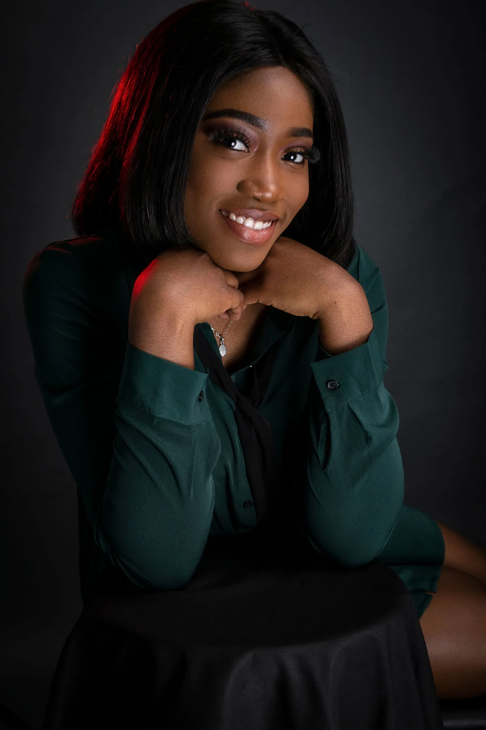
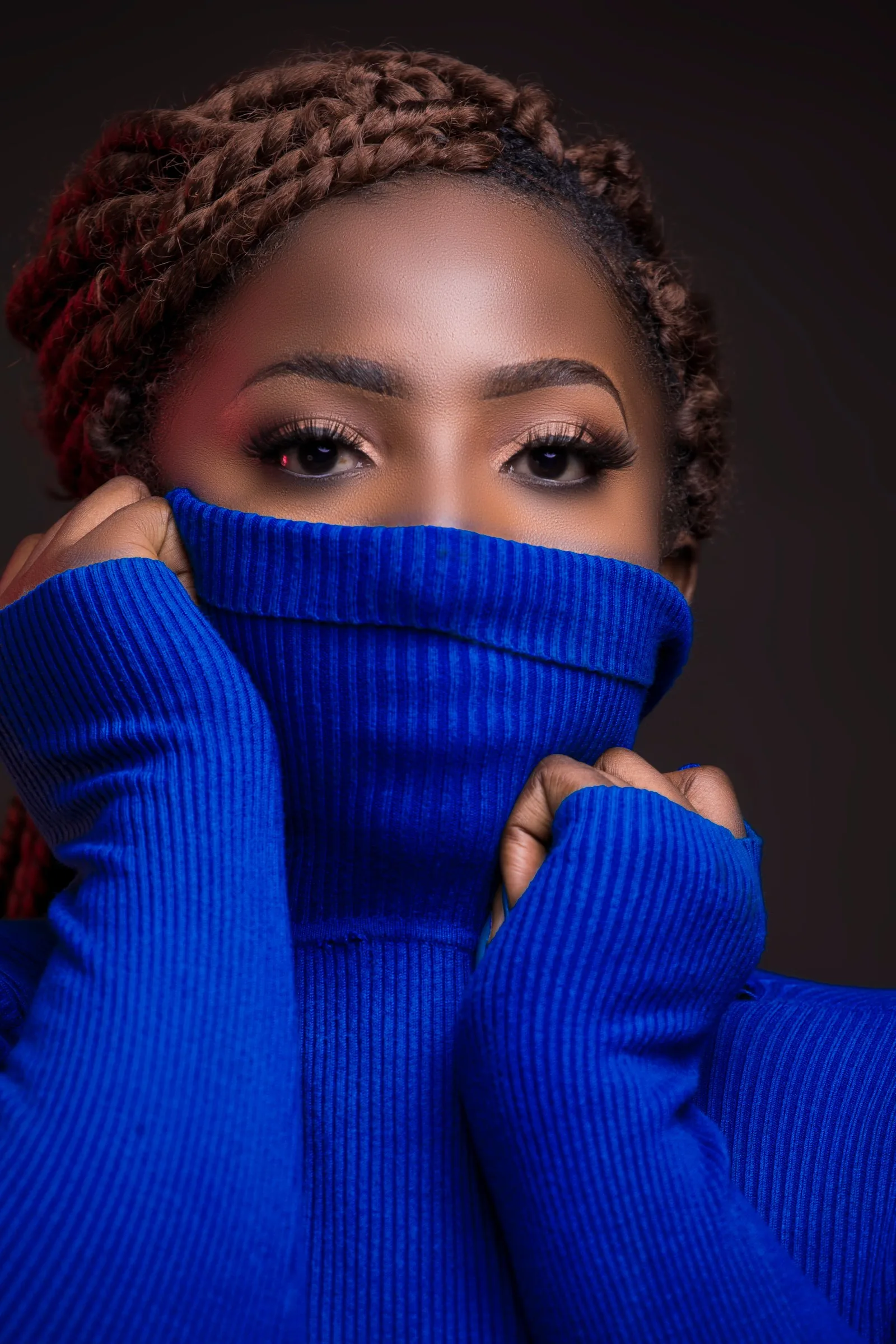
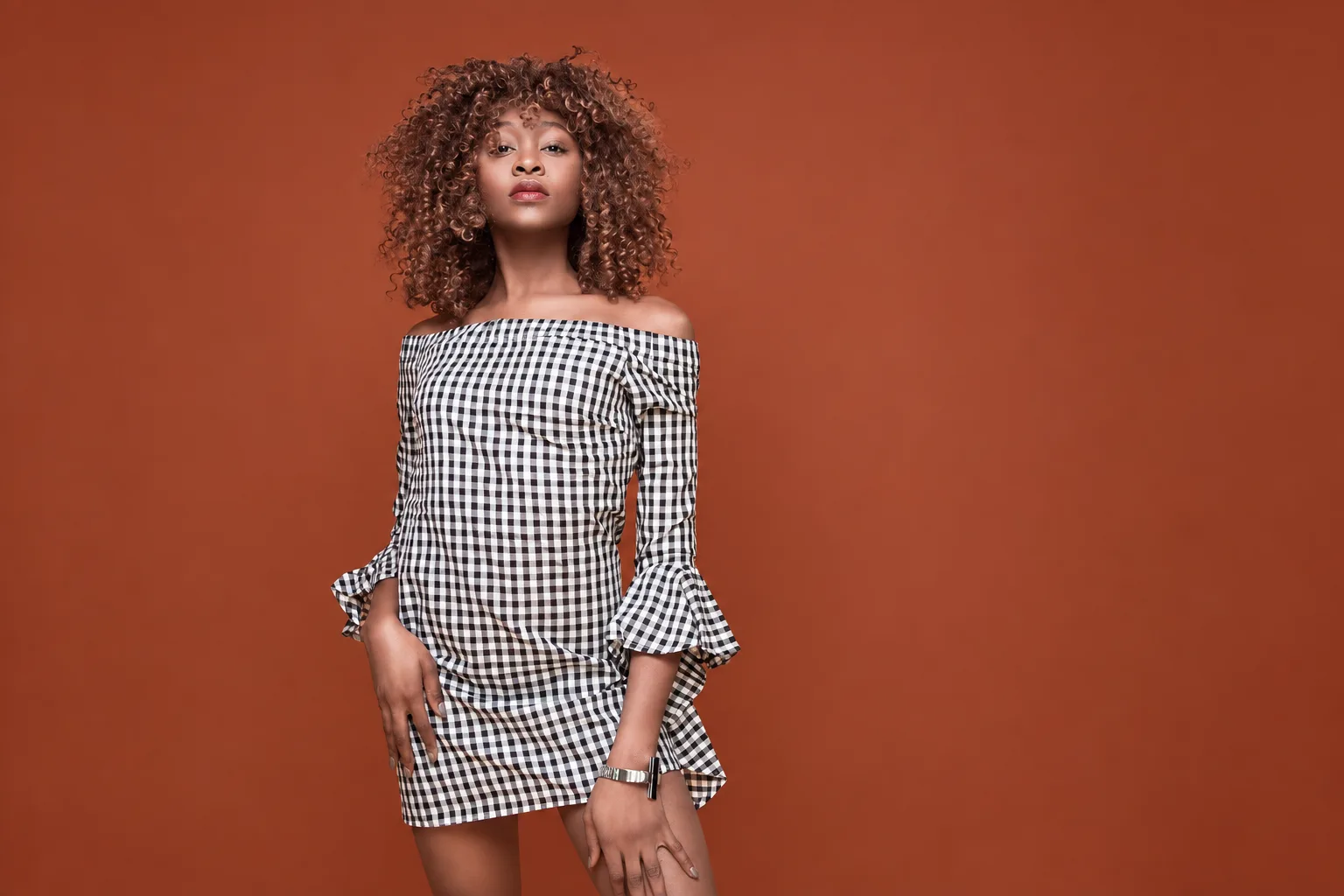
For this article, the hero and supporting images are AI color-edited versions of separate user-provided fashion photographs. The edits change only color direction: the hero jacket and the supporting backdrop. They are used only to illustrate a rust color direction; they are not evidence of a Yinshan Fashion facility, customer, garment program, or approved production sample. This distinction is deliberate: image inspiration can help frame the color conversation, while physical samples and records control production decisions.
What should buyers check about buyer checklist for a rich rust apparel collection?
Before rich rust moves into development, a buyer should be able to answer these questions:
- What exact undertone, depth, surface, and visual role does the rust direction need to have?
- Which styles use rust as a body color, a limited colorway, a print ground, an accent, a component, a label, lining, or packing detail?
- Which reference is inspiration, which proof can control the current decision, and what question must the next proof answer?
- Which fabric construction, finish, wash, print, lining, rib, thread, closure, decoration, label, or packing choice can change the visible result?
- Which companion colors need to match, coordinate tonally, contrast deliberately, or remain an accepted difference?
- Which reviewer owns the decision, which version is approved, and which later change would reopen the color route?
How can Yinshan Fashion support a rich rust fashion brief?
Yinshan Fashion combines more than 30 years of garment production experience, an in-house design team, and long-term cooperative factory resources to help buyers move from a visual color direction to a practical apparel development route. The useful input is not a perfect tech pack. A buyer can start with a reference image, intended product categories, target customer, fabric direction, desired rust relationship, components, label and packing needs, sample objective, quantities, target market, and the decisions where the team needs advice.
The value is in making the choices visible early: what the image communicates, what the fabric must prove, which components influence the color, what the sample should answer, and which record will control the move into bulk. Rich rust can be a dependable collection direction when the buyer treats it as a product decision rather than a color name. To discuss a project-specific route, contact Yinshan Fashion with the relevant product references, fabric direction, quantities, and open questions.
Rich rust development kit
Three controls that turn a rich rust reference into a usable apparel colorway
A rich rust program becomes repeatable when the team defines its undertone, proves it on the intended fabric route, and retains one clear approval record for every style-color-material combination.
Name the rust direction
Record whether the target is red-brown, clay, copper, tobacco, or a softened brick direction, plus its intended depth, surface, and product role.
Prove it on the garment route
Review the color on the selected base fabric, finish, wash, lining, rib, thread, closure, print, and label relationship rather than on a screen image alone.
Release one controlled version
Keep the accepted reference, proof version, style-material scope, visible components, comments, exceptions, and authorised changes in the bulk record.
Buyer actions and factory questions before rich rust moves into a bulk apparel programme
Use this record to connect the intended rust direction with fabric behavior, related colors, components, samples, private-label details, packing, quantities, and approval scope. Material availability, commercial terms, testing, timing, and production routing remain programme-specific.
| Decision area | What the buyer should prepare | What to ask the factory |
|---|---|---|
| Color direction and role | State the target undertone, depth, visual reference, product categories, whether rust is a body color or accent, adjacent shades, owner, and open decisions. | Which styles and material routes need the earliest proof, and what does the current reference communicate versus leave unresolved? |
| Fabric and finish | Name the proposed fibre route, construction, texture, weight, sheen, opacity, wash, print, coating, lining relationship, and the intended surface impression. | How can the named fabric route shift rust toward red, brown, orange, dullness, brightness, or uneven depth? |
| Palette and components | Map cream, brown, charcoal, blue, green, thread, rib, lining, buttons, labels, prints, and packing details to exact match, tonal coordination, contrast, or an accepted difference. | Which visible components require a physical comparison or a separate proof before the garment sample is approved? |
| Sample objective | Identify the proof version, material base, reviewer, viewing conditions, requested adjustment, decision owner, and the one product question the next sample must answer. | Does the current stage require a swatch, Lab Dip, strike-off, trim review, applied garment sample, or a broader size or wash check? |
| Private-label finish | Specify label artwork, care and composition wording, hangtags, barcode fields, folding or hanging route, protective packing, and color-sensitive presentation details. | Which branding or packing components change the appearance of the rust garment and need coordination on the physical product? |
| Bulk and repeat release | Retain the approved style-color-material map, fabric and trim references, proof evidence, construction points, quality priorities, quantities, exceptions, and authorised changes. | Where is the controlling record stored, and which fabric, component, wash, or packing change requires a new buyer decision? |
Continue the production conversation
Rich rust apparel development: color role and proof record
| Development point | Buyer record | Factory question before moving forward |
|---|---|---|
| Color direction | Undertone, depth, surface impression, source reference, working description, date, owner, and proposed product role. | What does the current reference communicate, and what physical proof is needed before the named rust direction can move forward? |
| Style and material scope | Product categories, fabric construction, finish, wash, opacity, sheen, texture, and any style-specific risk. | How can this fabric and garment route change the apparent rust depth, warmth, or consistency? |
| Palette relationship | Companion colors, visual ratio, garment placement, and whether each relationship is matching, tonal, contrast, or accepted difference. | Which body fabrics or components need side-by-side review to protect the intended earth-tone balance? |
| Components and decoration | Rib, lining, thread, closures, prints, embroidery, labels, hangtags, and packing details with their intended color relationship. | Which visible components need a separate color proof, applied sample, or decision record? |
| Sample evidence | Proof version, fabric and trim references, viewer notes, sample objective, approval owner, decision wording, and remaining question. | What does the current proof approve, and what must still be reviewed on a sample or later production gate? |
| Bulk and repeat | Approved style-color-material map, reference location, quality priorities, exceptions, quantity structure, and authorised changes. | Where is the controlling production record, and which later change requires the buyer to review the rust route again? |
Buyer FAQs
What is rich rust in fashion?
Rich rust is a broad apparel color direction that can sit between red-brown, clay, copper, tobacco, brick, and softened burnt orange. Define its undertone, depth, surface, material scope, and product role rather than relying on the name alone.
Why can rich rust look different on fabrics?
Fibre, yarn, construction, texture, opacity, sheen, dye route, wash, print, coating, and finish can change how a rust shade appears. Review the intended direction on the selected material and beside the visible components of the garment.
Which colors work with rich rust apparel?
Cream, oat, soft grey, stone, brown, charcoal, washed black, deep blue, muted sage, and peacock green can be useful companions when the product application supports the relationship. Define the garment, component, ratio, and approval scope before treating a pairing as final.
Does a Lab Dip approve a rich rust garment for bulk production?
A Lab Dip can answer a stated color question on a named fabric base. It does not automatically approve a different material, wash, print, component, construction route, or complete garment. Keep its scope in the record and use further evidence when the product route requires it.
What should buyers send Yinshan Fashion for a rich rust apparel project?
Send the visual reference, intended color role, products, fabric direction or open material questions, components, decoration, private-label needs, sample objective, quantities, target market, and the decisions where advice is needed. Yinshan Fashion can then discuss a custom/private-label development route for the stated scope.