
Article
What should buyers know first?
Short answer: A B2B buyer guide to using peacock green across private-label apparel through color definition, fabric sheen, palette roles, components, samples, inspection, and bulk-release records.
What is peacock green in fashion?
Peacock green in fashion is a jewel-tone direction that sits between deep green, teal, blue-green, and dark turquoise. It can look richly green on one fabric and noticeably bluer on another. That movement is part of its appeal, but it is also why a buyer should not treat “peacock green” as a complete production instruction. The intended undertone, depth, saturation, sheen, product role, and relationship with nearby colors need to be stated before a supplier can prepare the right fabric, sample, trim, and bulk-production route.
For a private-label collection, peacock green can bring recognition without using a very bright color. It can carry a fluid blouse, structured dress, soft shirt, knit layer, jersey set, statement lining, print ground, embroidered element, or a limited jewel-tone capsule. The commercial choice is not to put it on every product. It is to decide where this green earns high visual exposure, where it works as a controlled accent, and what physical proof will establish the accepted version.
Yinshan Fashion supports custom and private-label bulk programmes rather than unrestricted ready-stock wholesale. A productive peacock-green brief identifies the buyer's product categories, target customer, intended color role, fabric behavior, construction or decoration, related shades, labels, packing, sample objective, quantity assumptions, destination, and open decisions. A digital reference can explain mood, surface, and styling. It cannot confirm material availability, a dye result, cost, testing, or delivery terms.
The useful sequence is to define the intended green, review it on the selected fabric and finish, assess it beside visible components, approve each proof for a named scope, and retain that decision through factory handover and repeat orders. This turns a jewel-tone idea into an apparel route a buyer can control.
How is peacock green different from teal, emerald, and forest green?
Peacock green often carries both blue and green. Teal may read cleaner and more blue-forward. Emerald can be clearer, brighter, and more green. Forest green usually feels more yellow-green, muted, or naturally dark. The terms overlap in ordinary conversation, so words alone do not settle the buyer's intent. Write what the finished color must do: for example, retain blue depth beside black, avoid a yellow cast beside ivory, feel dark without becoming navy, or show a controlled sheen on a fluid woven.
Use a working reference plus a short description. State whether the green should be blue-leaning or green-leaning, dark or mid-depth, clear or softened, dry or luminous, and whether the fabric surface must create visible tonal movement. Record the image or physical source, date, decision owner, material scope, and the question that the next proof must answer. “Return a slightly bluer option on the selected satin-like woven” is a useful comment. “Make it more luxurious” is not enough for a sample room or factory.
The apparel color palette planning guide helps separate inspiration images from controlling physical references and dated approvals. A retained garment, swatch, Lab Dip, strike-off, or approved sample can control a specified scope only when the buyer has stated the material, style, finish, component, and decision it applies to.
Why does fabric sheen matter to a jewel-tone green?
Fabric surface changes the visual weight of peacock green. A smooth, lustrous woven can make blue-green depth appear more luminous. A matte twill can make the same direction feel quieter and more grounded. Rib knit creates shadow lines that can make the color look darker. Brushed fleece softens the surface. A fluid fabric may look green in one fold and blue in another. Construction, density, texture, opacity, finish, print method, coating, wash, and lighting can all influence the result.
Start with garment behavior, not just color preference. A blouse may need soft drape, coverage, collar shape, button stability, and a controlled sheen. A dress may need lining compatibility, seam balance, movement, zipper behavior, and enough color depth across the full body. A knit may require review of stretch, recovery, rib texture, and neckline components. A jersey item may need the green to remain clear beside a print or embroidered motif. The fashion clothing fabric selection guide can help a buyer connect these material questions with the visual route.
If the fabric is not yet chosen, treat peacock green as provisional. Identify whether the next step is a swatch, Lab Dip, strike-off, component proof, or applied garment sample. Each proof should have a purpose. It is more useful to ask “does this base fabric keep the required blue-green balance after pressing?” than to collect unlabelled green options.
How should buyers use peacock green across dresses and blouses?
Peacock green can be a strong body color for a dress because it can support drape, a defined waist, a structured neckline, a fluid skirt, or a polished eventwear direction. The buyer should still decide what the color needs to show on the complete garment: opacity, lining relationship, zipper placement, seam shadow, hem balance, and the relationship between green fabric and jewelry, trims, or a label package. A small swatch cannot prove all of these points.
For blouses and shirts, the color can work through collar and placket definition, cuff construction, button choice, pocket placement, or a contrast print and facing. A dark jewel tone can make finishing look composed, but it may also hide detail in low-light photography. Ask how the intended fabric holds its color under pressing, around buttonholes, at seams, and when it sits beside a tonal or contrasting component.
Begin with a limited group of applications. A buyer may use peacock green on a hero dress and a fluid blouse, then carry it as a print or lining relationship on a related casual layer. Another collection may reserve it for one special colorway while using neutral base colors elsewhere. This creates a manageable sample route and gives the supplier and manufacturer a clear priority list.
Which colors should sit beside peacock green?
Peacock green can work with ivory, stone, soft grey, black, charcoal, deep ocean blue, rust, muted green, and selected warm metallic details when the exact garment application supports the relationship. The useful question is not “which colors go with green?” It is what each adjacent shade must do. A neutral may make the green appear clearer. A dark partner may create a sophisticated tone-on-tone story. Rust can provide a warm counterpoint. Deep ocean blue can create a darker jewel-tone pairing that must retain separation on the selected surfaces.
Assign pairings to real products and components. Ivory print ink on a green jersey has a different exposure from an ivory inner label. A rust button may be a focal point, while rust lining may only be visible in movement. A black zipper tape can look intentional or can make the body fabric look too dark. The deep ocean blue guide and the rich rust guide offer useful color-development context, but neither replaces a proof on the actual material route.
Keep the palette record specific. For every style, note the body material, the green role, adjacent shades, components, proof type, viewer, approval status, and unresolved question. This helps prevent a successful green on one blouse fabric from being treated as automatic approval for a dress, knit, washed jersey, print ground, or different trim source.
How should trims and decoration support a green jewel tone?
The garment body is only one part of the color result. Thread, zipper tape, buttons, snaps, elastic, rib, lining, facings, prints, embroidery, woven labels, heat transfers, hangtags, bags, and cartons can either support peacock green or create an accidental interruption. Map the high-exposure components and name whether each one needs exact matching, tonal coordination, neutral support, deliberate contrast, or a separate proof.
For prints, document the artwork version, ground fabric, color list, scale, placement, coverage, and next review. A digital artwork file does not prove a high-coverage print on a textured knit, a washed jersey, or a glossy woven. For embroidery, identify the thread route, density, backing, fabric behavior, and whether the green is a body color, a contrast ground, or a supporting note. A visible button, facing, or lining deserves an applied sample review when it changes the way the buyer reads the jewel tone.
Private-label presentation needs the same care. Label artwork, care and composition information, hangtags, barcode data, folding, protective packing, and product photography should describe the same current style-color-material version. The private-label page is a practical starting point for those inputs. A strong color story becomes less reliable if the neck label, hangtag, or individual pack is based on an earlier green sample.
What should a peacock green sample prove before bulk production?
A sample should answer one stated product question. It may prove that the selected fabric holds the intended blue-green balance, that a sheen level is appropriate, that the garment remains distinct from dark blue and black, that a print or embroidery has enough contrast, or that lining and trim work with the body color. The sample is not simply a photo opportunity. It is evidence for a buyer decision and a manufacturing handover.
Record the sample version, material and trim references, construction route, viewing notes, reviewer, decision owner, accepted points, remaining questions, and next action. A Lab Dip can be useful for a named color on a named fabric base. It does not automatically approve another surface, wash, print, component, construction, or complete garment. An applied sample may be necessary when fit, seam shadow, finishing, and visible components affect the final perception of the green.
Yinshan Fashion combines design and fabric advice with pattern and sample coordination, and works with long-term cooperative factories supported by more than 30 years of production experience. This is useful when a buyer needs the design direction, material response, component decisions, and production record to stay aligned. It is not a substitute for a project-specific confirmation of the product, material, quantity, commercial terms, and approvals.
How should factories inspect peacock green garments?
Dark jewel tones should be checked against the right reference and scope. The inspection team needs to know which proof controls the named style-color-material route, which areas have the greatest visual exposure, and which components are intended to match, coordinate, or contrast. On a green dress, key areas may include seam shade, lining, zipper insertion, neckline, gathers, hem, pressing, labels, and packing. On a blouse, the focus may include collar, placket, cuffs, buttonholes, buttons, pocket edges, print placement, and component relationships.
The objective is not to promise that every garment will look identical under all light. It is to identify the approved route, compare the appropriate areas, document a relevant finding, and raise an exception when a material, wash, component, or construction change makes the original approval insufficient. A quality team cannot infer whether a green should be bluer or darker from a casual image. The buyer's acceptance criteria and approved sample record need to make the intended decision usable.
Yinshan Fashion acts as a supplier and manufacturer by connecting the buyer's brief, color and fabric direction, sample comments, labels, and packing requirements with the appropriate factory coordination. The partner factory should work from the authorised record. That shared version control is more useful than a generic promise that a jewel tone will be handled correctly.
How should buyers give useful color comments to a manufacturer?
Color comments are most useful when they describe a visible difference, name the material and proof being reviewed, and state the direction of the next action. A buyer may write, “keep the current blue-green balance but reduce the yellow cast on this matte crepe,” or “retain the sheen but make the dress body distinguishable from the black lining under neutral light.” These statements identify what was seen, what should remain, what should change, and which physical route is in scope. A request such as “make the green more premium” leaves too much interpretation for the development team.
Attach the comments to the current version. Identify the style, color description, fabric base, finish, trim set, proof or sample version, review date, reviewer, and decision owner. If photos help explain a point, mark what they are showing without allowing the photo to quietly replace the physical reference. A buyer can note that a particular image illustrates the desired depth or styling relationship while keeping color approval tied to the named swatch, Lab Dip, strike-off, or garment sample.
Give the factory a clear next question. Does the buyer need a slightly bluer option on the same base? Does a component need to be viewed beside the body fabric? Does the current sample show the right color but leave a wash or print question unresolved? Does a different fabric need its own proof? This keeps sampling efficient because each return answers a defined decision instead of changing color, fabric, fit, trim, and construction at once.
Yinshan Fashion can help organize this communication as part of a custom development route. The buyer still owns the commercial direction and final acceptance. The supplier and manufacturer add value by making the open decision, evidence source, material scope, and factory handover visible enough for the next stage to work from the same version.
How should a jewel-tone collection be presented to retailers and buyers?
Peacock green often attracts attention before a buyer touches the garment, which makes presentation decisions important. Product photography, styling, sample cards, line sheets, and retail-facing color names can help communicate where the jewel tone belongs in the range. They should not overstate what has been approved. A photo can show a green dress beside stone accessories, a dark blouse layered with a neutral jacket, or a casual piece using green as an accent. It should be clear which elements are visual inspiration and which are the current approved product version.
Plan the product relationship as well as the color. A retailer may need one hero green style supported by neutral separates, or may prefer a limited capsule where the same color appears across a dress, blouse, knit, and small accessory. A brand selling online may want a color that photographs with visible depth against a clean background. A boutique may value the way the green stands beside warm rust and ivory items on a rail. These are assortment and presentation choices; the factory can explain development and production implications, but it should not guess the buyer's commercial strategy.
Keep the product data aligned. The style code, color description, fabric, approved sample version, label artwork, packing route, product imagery, and selling copy should refer to the same item. A mismatch can cause an accurate garment to be merchandised with an outdated shade name or an old image. This is particularly important for a blue-green jewel tone because a descriptive name alone may create different expectations across a design team, supplier, retailer, photographer, and customer.
When the buyer plans a multi-style collection, use a style-color-material map that shows the role of peacock green on each product. State whether it is a hero body color, a tonal layer, an accent, print ground, lining, label, or packaging detail. That record supports line planning, sample review, factory coordination, and later repeat orders without turning one photograph into a blanket approval.
Before a selling sample is photographed or shown to a wholesale customer, confirm which version is being used. If the sample still awaits a fabric, trim, wash, or label decision, record that limitation internally. A well-styled provisional garment can be useful for direction, but it should not create an accidental promise about the version that will move into bulk production.
How should peacock green be protected through bulk and repeat orders?
Bulk control begins with an approved production record. It should connect the style code, working color description, material and component references, accepted proof, construction points that affect appearance, sample comments, labels, packing, quantities, quality priorities, accepted exceptions, and authorised changes. The aim is not to create a large document for its own sake. It is to make the current product version usable for cutting, sewing, finishing, inspection, packing, and export preparation.
For a repeat order, make a difference list. Confirm what stays the same and what changes: fabric availability, yarn or base, finish, dye or print route, wash, trim source, lining, label package, packing route, size mix, destination, or quality priorities. A previous peacock-green sample is useful history. It is not automatic approval once a material or component route changes. This protects both the buyer and factory from relying on memory.
How should product photography support, rather than replace, approval?
Photography can help show silhouette, styling, texture, and the relationship between peacock green and other colors. It cannot replace the material proof that controls a bulk decision. Backdrop, exposure, editing, display settings, and nearby products can make a blue-green garment look darker, bluer, greener, or brighter than it is. State whether an image is intended as mood reference, product content, or a visual check of an approved sample, and keep that role separate from the production record.
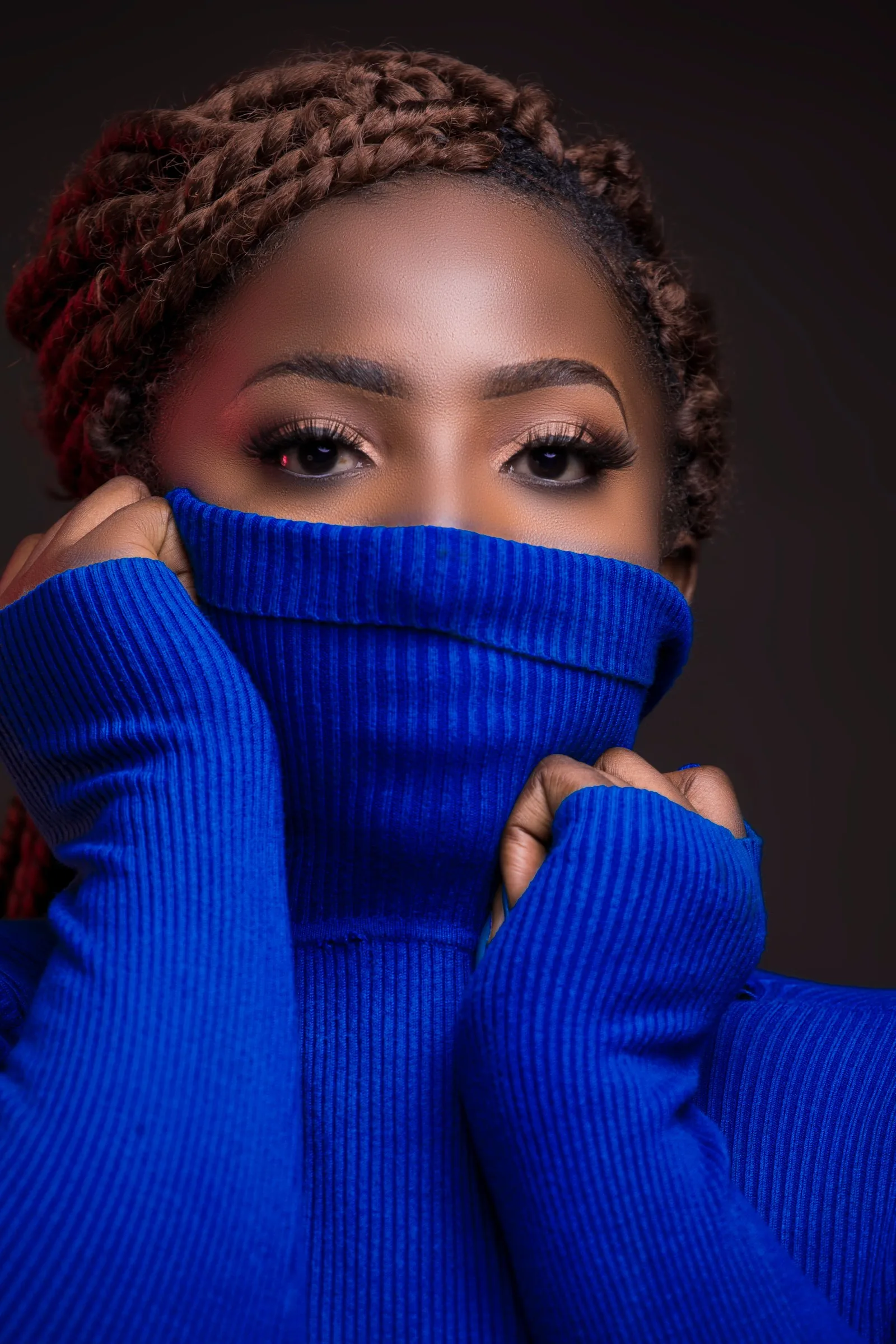
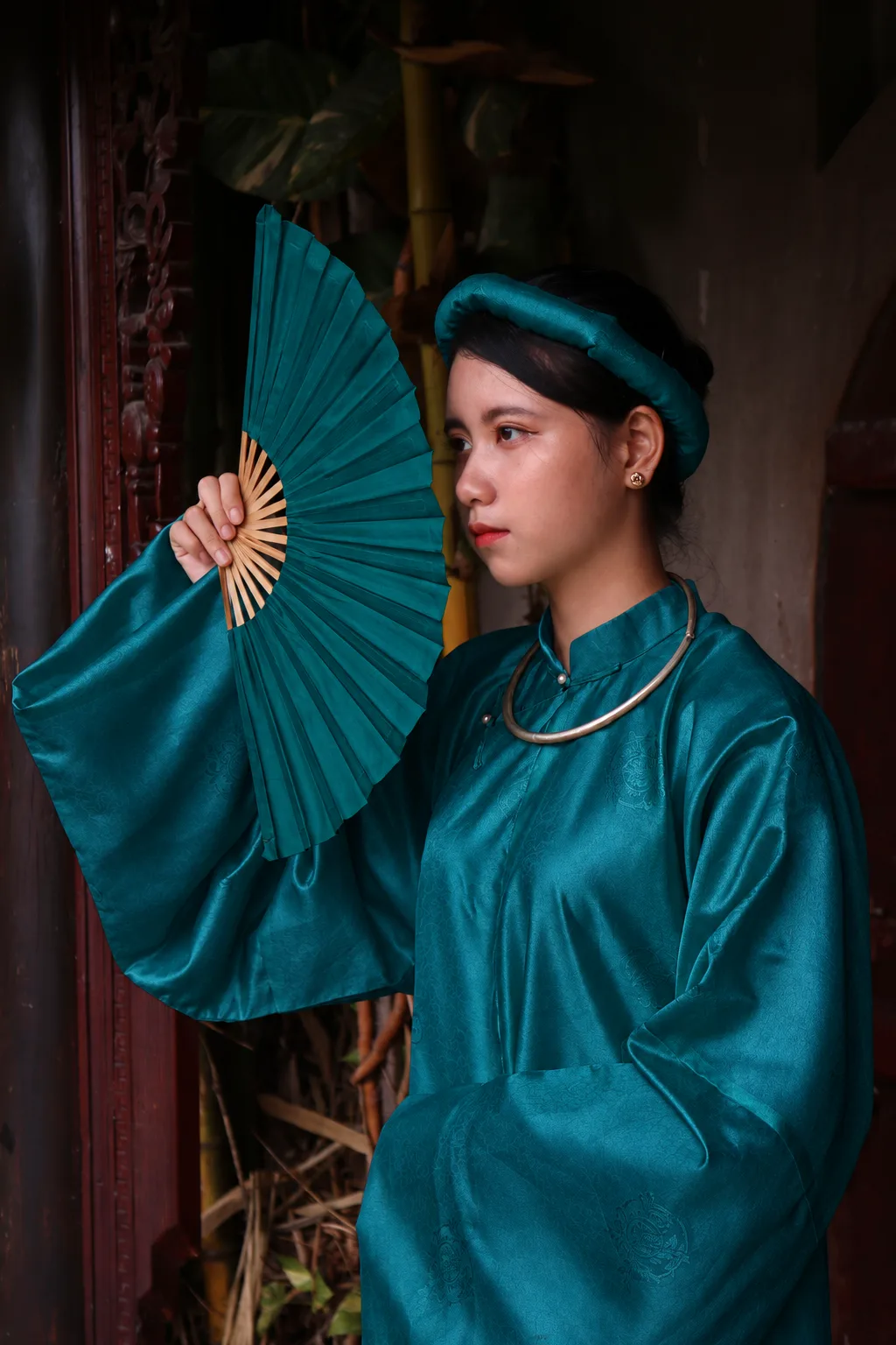
The hero image for this article is a user-provided green blouse photo. The supporting image is a user-provided fashion portrait where only the original pale-green dress, fan, and headband were color-edited to peacock green. Neither image has a visible watermark. The images illustrate a color discussion; they do not represent a Yinshan Fashion facility, customer, production order, or approved sample. Physical proofs and versioned records control the production decision.
What should buyers check about buyer checklist for a peacock green private-label collection?
Before development moves forward, a buyer should be able to answer practical questions. What does the chosen peacock green mean relative to teal, emerald, forest green, dark blue, and black? Which styles and material routes carry it? What surface, sheen, and wash direction is intended? Which components need matching, coordination, or contrast? Which proof answers which question, and what change reopens the decision?
Send the strongest available reference, product categories, target customer, fabric direction or required behavior, color role, adjacent shades, construction or decoration details, private-label needs, sample objective, quantity assumptions, target market, and open questions. Yinshan Fashion can then advise on a project-specific route from reference to sample and bulk-ready production record.
Peacock green development kit
Three controls that make peacock green usable in a private-label collection
A jewel-tone green becomes commercially usable when a buyer defines its blue-green balance, reviews its sheen on the chosen material, and holds one clear approval record for every style-color-material route.
Define the jewel-tone direction
Record how blue, green, dark, vivid, cool, or muted the target must feel, plus its product role and visible palette relationship.
Review surface and components
Assess the green on the intended fabric, finish, lining, trim, print, label, and packing route instead of approving a screen image alone.
Release a usable version
Keep the reference, proof version, style-material scope, component choices, comments, exceptions, and authorised changes together before bulk production.
Buyer actions and factory questions before peacock green moves into a private-label apparel programme
Use one versioned record to connect the intended green direction with fabric behavior, palette partners, components, samples, labels, packing, quantities, and approval scope. Material availability, commercial terms, tests, timing, and production routing remain programme-specific.
| Decision area | What the buyer should prepare | What to ask the factory |
|---|---|---|
| Jewel-tone definition | State the target blue-green balance, depth, visual reference, styles, material routes, adjacent shades, owner, and open questions. | What makes this route peacock green rather than teal, emerald, forest green, or a dark blue on the intended material? |
| Fabric and sheen | Name the fibre route, construction, texture, drape, opacity, sheen, print, wash, lining relationship, and desired surface impression. | How can the selected surface make the green look bluer, yellower, flatter, darker, brighter, or less even? |
| Components and palette | Map black, ivory, stone, rust, deep blue, thread, rib, lining, buttons, labels, prints, and packing to matching, coordination, contrast, or accepted difference. | Which high-exposure component needs a physical comparison before the garment sample is approved? |
| Proof objective | Identify the material base, proof version, reviewer, viewing notes, requested adjustment, decision owner, and one question for the next sample. | Does the route need a swatch, Lab Dip, strike-off, trim review, applied garment sample, or wash review? |
| Private-label presentation | Specify label artwork, care and composition wording, hangtags, barcode data, folding or hanging route, protection, and color-sensitive presentation points. | Which branding or packing detail changes how the jewel tone is perceived and needs review on the physical product? |
| Bulk and repeat | Retain the approved style-color-material map, fabric and trim references, proof evidence, quality priorities, quantities, exceptions, and authorised changes. | Where is the controlling record kept, and which later change requires a new buyer decision? |
Continue the production conversation
Peacock green decisions from reference to bulk release
| Stage | Buyer decision | What to review | Production record |
|---|---|---|---|
| Color definition | Set the blue-green balance and product role | Undertone, depth, saturation, surface, visual reference, and relationship with navy, black, and other greens | Dated color brief, reference purpose, style-material scope, and open-question list |
| Material route | Choose a fabric and finish that support the jewel tone | Texture, sheen, opacity, drape, recovery, dye or print route, wash, lining, rib, and component relationship | Fabric and component references with stated proof objective |
| Sample evidence | Review the green on the actual garment route | Full-garment depth, seam shade, finish, construction, components, labels, and presentation | Proof version, viewer notes, decision wording, remaining question, and next action |
| Bulk and repeat | Release the approved version and identify change triggers | Style-color-material map, quality priorities, labels, packing, quantities, exceptions, and changes | Production pack with controlling references and authorised changes |
Buyer FAQs
What is peacock green in fashion?
Peacock green is a dark blue-green jewel-tone direction that can sit between teal, green, and deep turquoise. Define its undertone, depth, surface, material scope, and product role rather than relying on the name alone.
How is peacock green different from teal?
Peacock green usually has darker, richer green-blue depth, while teal can read cleaner and more blue-forward. The exact difference depends on the fabric, finish, lighting, and adjacent components, so it should be reviewed on the intended garment route.
Why does peacock green look different on fabrics?
Fibre, construction, texture, sheen, opacity, finish, wash, print, and lighting can shift the visible blue-green balance. Review the intended direction on the selected material and beside the garment's exposed components.
Which colors work with peacock green apparel?
Ivory, stone, grey, black, charcoal, deep blue, rust, and muted green can work when assigned to a specific garment or component relationship. Define the ratio, surface, exposure, and approval scope before treating a pairing as final.
What should buyers send Yinshan Fashion for a peacock green project?
Send the visual reference, intended color role, products, fabric direction or open material questions, finish or wash expectations, components, decoration, private-label needs, sample objective, quantity assumptions, target market, and open decisions. Yinshan Fashion can then discuss a custom/private-label bulk development route for that scope.