Article
What should buyers know first?
Short answer: A B2B guide to using bright pink in commercial apparel, from color role and fabric response to decoration, samples, components, and bulk-release records.
What should buyers know about bright pink in fashion?
Bright pink in fashion can create immediate recognition, but it also asks for more control than a neutral color. The term may describe hot pink, fuchsia, electric pink, vivid rose, magenta-leaning pink, or another saturated direction. On a garment, apparent brightness can change with fibre, construction, finish, lighting, print coverage, and every component placed beside it. A buyer should therefore treat bright pink as a defined product decision, not as a broad mood-board description.
For commercial apparel, begin with a color role. Is bright pink the hero body color for a dress, knit, shirt, trouser, or active-inspired layer? Is it a limited fashion colorway, a stripe, a print ground, an embroidered element, a label color, or a small pack-in detail? The answer determines the evidence that is needed. A vivid garment body has different visual exposure from a contrast binding or a small woven label.
Yinshan Fashion supports custom and private-label bulk programmes rather than unrestricted ready-stock wholesale. A useful development brief identifies the styles, intended wearer and channel, fabric route, construction, decoration, bright-pink role, components, sample purpose, quantity assumptions, destination, and open questions. A supplied image can communicate a desired color energy, silhouette, or styling relationship. It cannot on its own confirm fabric availability, dye route, testing, price, or delivery terms.
The practical approach is to define the named pink, review it on the intended material, map the components that change the result, use proofs for their stated scope, and retain the approved information through bulk and repeat orders. That sequence lets a strong color remain intentional rather than becoming an uncontrolled variation.
What should buyers check about give hot pink fashion trend a specific role in the line?
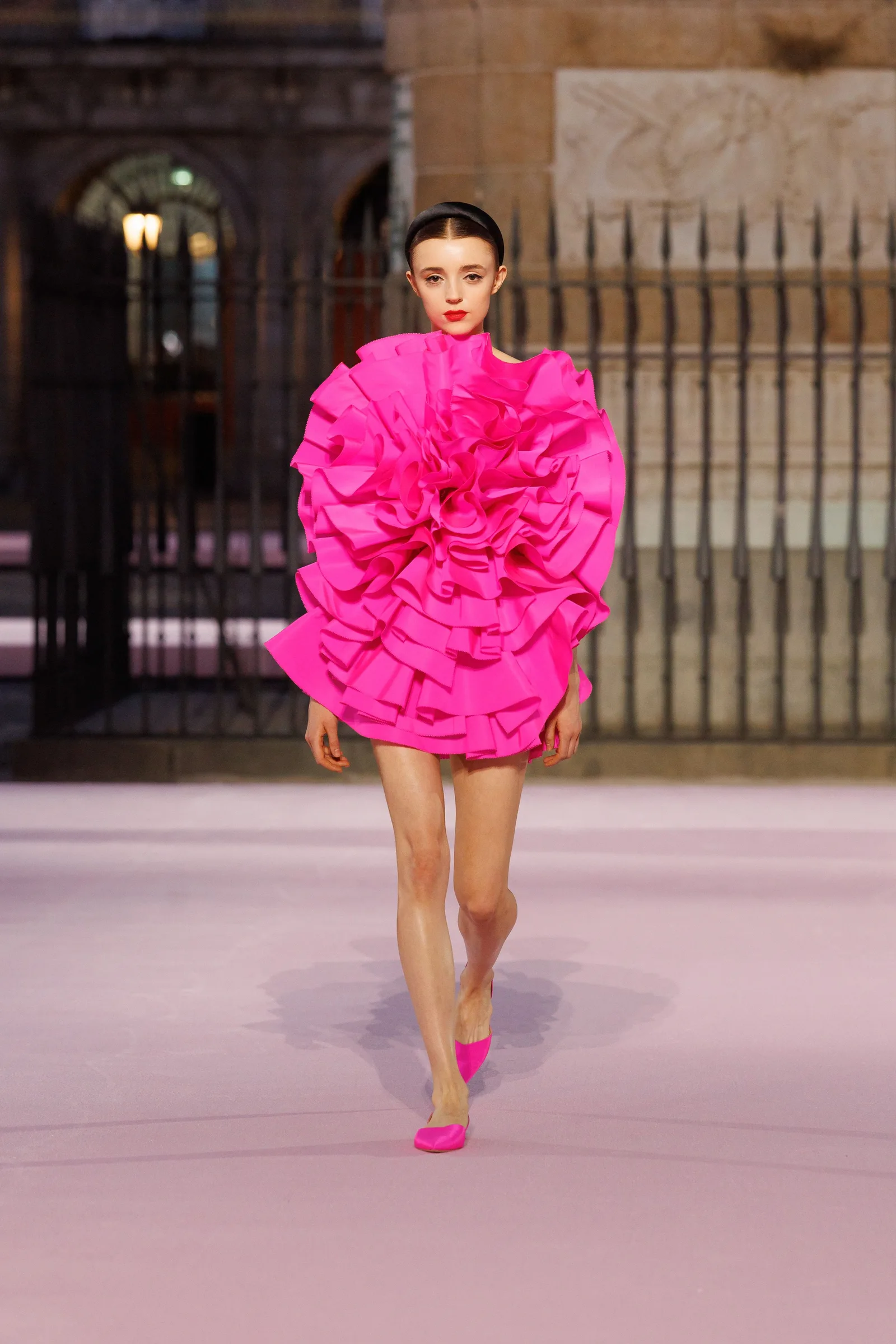
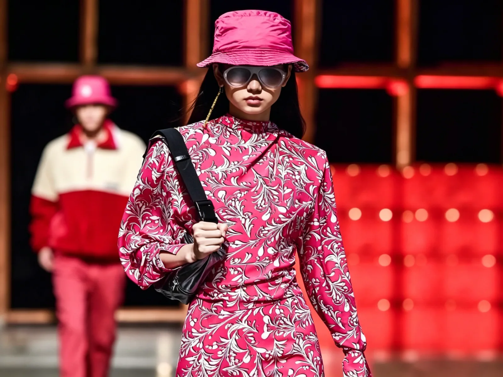
The hot pink fashion trend can work as a collection signal, but the buyer still needs to decide where it earns its space. A head-to-toe pink dress can carry an eventwear, resort, occasionwear, or expressive casual direction. A bright pink knit can make a focused statement inside an otherwise neutral drop. A pink panel, pocket, collar, rib, piping, graphic, or waistband can add energy with a smaller approval burden. Record the intended role for each style instead of treating every use as the same color decision.
Build a style-color-material map. For every route, note the style code, material and finish, color application, adjacent shades, visible components, proof type, sample status, approval owner, and unresolved question. This makes it clear whether an accepted knitted swatch also applies to a smooth woven, a washed jersey, a printed shell, or a tonal label. It usually does not unless the approval record says so.
The apparel color palette planning guide offers a useful structure for separating inspiration, controlling references, material proofs, and dated decisions. A physical standard, retained sample, approved garment, or named color proof can control a stated scope when the buyer explicitly identifies it. A photograph can remain valuable for styling and proportion while staying an inspiration reference until it is reviewed on the actual product route.
How should buyers define the pink before asking for a color proof?
Words such as neon pink, bubblegum, raspberry, fuchsia, rose, and magenta often carry different meanings for a designer, buyer, fabric supplier, sample room, photographer, and retailer. Start with a working color code plus a short description of the desired undertone, depth, saturation, and surface impression. State whether the intention is blue-leaning or red-leaning, clear or softened, glossy or dry, and whether the shade must sit beside black, white, denim, grey, brown, or another color.
Write comments as questions that a proof can answer. “Keep the current depth but reduce the purple cast on this compact jersey” is reviewable. “Make it feel more premium” is not. If a supplied image is important, describe what it is meant to communicate: perhaps a high-impact body color, the relationship with a neutral, or the scale of a decorative element. Then record what still needs to be checked on the selected material.
Screens cannot be the controlling production standard. Camera exposure, retouching, studio light, daylight, surrounding colors, compression, and display settings can make saturated pink appear warmer, cooler, brighter, or duller. Retain the reference source and date, but keep its authority separate from a material-specific proof.
How should buyers check how the fabric surface changes bright pink?
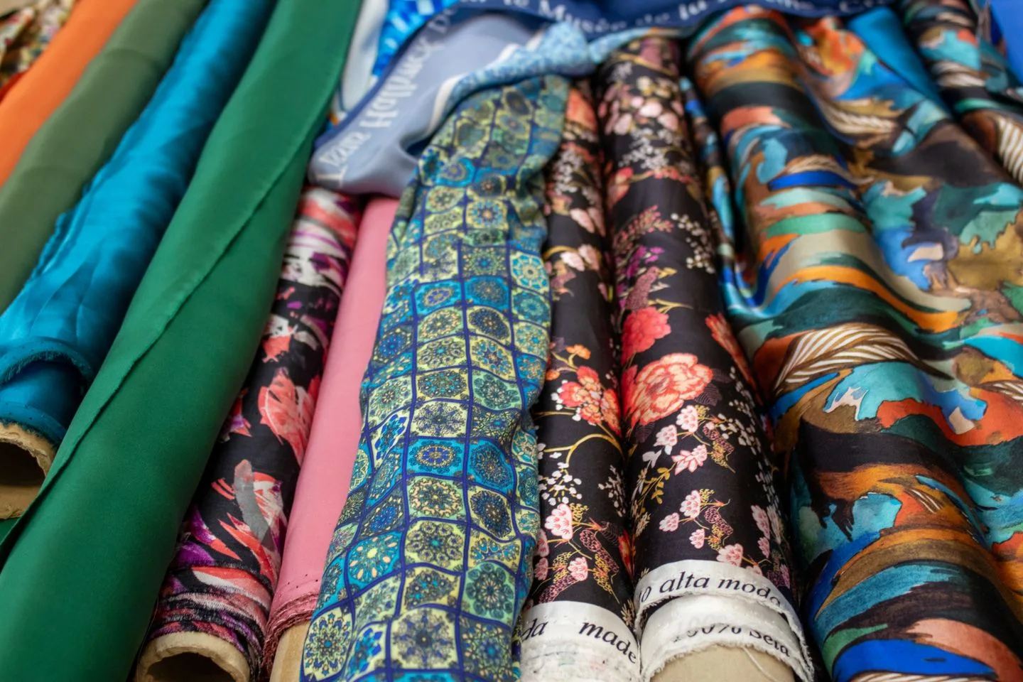
Bright pink can appear remarkably different across fabrics. A compact cotton jersey may look clean and direct. A brushed fleece can soften the color through its surface texture. A rib construction creates shadows that make a saturated pink appear deeper. A fluid woven can change the color as the garment moves. A shiny surface can look more luminous, while a matte twill can make the same direction feel more grounded. Dyeing, coating, printing, washing, and finishing may introduce further visible differences.
The fashion clothing fabric selection guide helps connect color expectations to material behavior, construction, components, and sample evidence. If the fabric route remains open, treat the pink direction as provisional. Specify whether the next step should be a swatch, Lab Dip, strike-off, component proof, or garment sample, and state which question that proof must answer.
Review visible materials together. Body fabric, lining, rib, thread, zipper tape, elastic, drawcord, buttons, snaps, print inks, embroidery thread, labels, hangtags, and packing components all influence how the final garment reads. For each one, name the intended relationship: exact match, tonal coordination, neutral support, deliberate contrast, or accepted difference. A deliberate contrast is a choice. An unrecorded mismatch is a later risk.
How should buyers build bright pink pairings through product applications?
Bright pink can sit confidently with black, white, cream, charcoal, dark denim, selected browns, navy, muted green, or carefully chosen lighter pinks. The useful question is not simply which colors match. It is how they are used on a garment. A black zipper tape will create a sharper, sportier contrast than a cream binding. A dark denim overshirt may control the perceived intensity of a pink tee. A pink print on a pale ground needs enough separation to remain legible. A similar rose tone can look accidental if the depth difference is too small.
Assign a pairing to a product decision. Is pink the body, panel, collar, pocket, stripe, print ground, lining, label, or packing detail? Is the partner color another garment in a look, a visible trim, or a photography background? Record the visual ratio and application area. This avoids a palette board becoming a vague instruction that different teams interpret differently.
The sage green apparel guide is useful for buyers considering a muted contrast, while the neutral color palette guide helps establish quieter supporting colors. Review each proposed relationship on the actual materials, because retail lighting and mobile screens can change the apparent balance.
How should buyers use bright pink in prints, embroidery, and limited details?
Bright pink does not have to cover an entire garment to have commercial impact. It can be used in a wordmark, graphic shape, stripe, repeat print, pocket facing, embroidered icon, piping, woven label, drawcord, or packaging accent. Each application carries a separate physical question. Ink coverage, base fabric, print method, curing, thread density, backing, scale, placement, and washing can change the perceived result.
Start with the actual artwork route. Record the version, target base material, intended placement, scale, color list, and the proof required. A digital artwork file may show that a bright pink accent is visible. It does not establish how the ink looks on a textured ground or whether a thread direction maintains its clarity against the chosen fabric.
For prints, ask whether a strike-off or applied sample is needed. For embroidery, identify the thread reference, coverage, density, backing, and base material. Keep accepted proofs with the associated artwork version. If the base, scale, method, or color list changes, the record should trigger a new review rather than borrowing approval from an earlier configuration.
What should buyers check about coordinate trims, labels, and packing around the pink?
The body fabric is only one part of a high-impact color decision. Thread, zippers, buttons, elastic, cord ends, labels, hangtags, stickers, poly bags, and cartons can make bright pink look cleaner, darker, warmer, or more commercial. Map these components on the styles with the greatest visual exposure. State where exact matching matters and where an intentional contrast or neutral support is acceptable.
Private-label details deserve the same traceability. A woven label may render pink differently from a printed neck label. A dark hangtag can shift how a vivid garment photographs. Retail-facing color names may change, while an internal code remains useful to keep artwork, labels, packing, and sample comments aligned. The private-label development page is a practical place to organise branding files, labels, and packing around real style-color-size decisions.
Keep the work proportional. A small inner-care label may not need the same proof as a contrast rib, prominent zipper tape, or oversized print. The decision record should make that distinction clear before components arrive in bulk.
How should buyers use Lab Dips and samples for the scope they prove?
A Lab Dip is a small dyed-fabric proof that can help assess a proposed color on a specified base. For bright pink, it can answer a narrow question about undertone, depth, or surface appearance. It is not automatic approval for a different fabric, wash, print, lining, or finished garment. Its record should identify the fabric base, finish information available at the time, reference source, version, date, reviewer, viewing notes, decision wording, and the question that remains open.
Useful comments describe the requested adjustment. “Keep the brightness but return a cooler option on the same woven base” gives a concrete next step. “Make it more exciting” does not identify the required color movement or material scope. A garment sample may be needed after a color proof when fit, seam shadow, construction, wash, print, embroidery, lining, or trims affect the complete visual result.
The fashion sample approval guide explains how buyers can link accepted samples to materials, fit, trims, quality priorities, labels, packing, and the next production decision. Yinshan Fashion can discuss sample requirements and applicable commercial terms for the stated product route. Confirm the current fabric, construction, decoration, quantity structure, and order details before treating any sample arrangement as applicable to a bulk programme. Keep the sample objective and the decision it is meant to support in the development record, so commercial discussion does not replace a clear technical approval scope.
What should buyers check about control a saturated color during bulk production?
Bulk color control is a defined review process, not a promise that every garment will look identical in every environment. The right controls depend on the material, shade, construction, components, quantity, and programme requirements. Ask how the approved reference is identified, when comparison takes place, which styles and components are included, who records a question, and who has authority to decide the next action.
Keep a release pack for each approved style-color-material route. It can connect the style code, fabric and component references, accepted swatch or sample, artwork, comments, proof scope, construction details, labels, packing, quantities, quality priorities, exceptions, and authorized changes. A change to a dye route, finish, print, component source, label, or packing option may require a decision about whether the original approval still applies.
For a repeat order, begin with a difference list. An earlier bright pink sample is useful history, but it cannot automatically approve a changed material, construction, component source, print, destination, or packing route. Identify what remains the same, what needs current evidence, and who will approve it.
What should buyers check about separate product photography from production approval?
Vivid color is often assessed through photos before a buyer sees the garment. Photography can communicate silhouette, styling, texture, and the intended relationship between bright pink and other pieces. It cannot replace the physical proof that controls bulk production. Lighting, backdrops, retouching, screen calibration, and adjacent garments can make the same product look more purple, red, luminous, or muted.
Before a shoot, state what the image needs to communicate. A team may want a bright pink dress to retain its clarity against a neutral setting or a pink trim to remain visible on a dark outer layer. Supply the approved style-color-material reference, retained swatch or sample when appropriate, and the working color code used in product data. Mark any item still awaiting a material, component, or sample decision so a temporary sample does not become an unintended production reference.
How should buyers plan variants without multiplying approval risk?
More than one pink can make a collection feel layered, but every additional variation creates another style-color-material route, component relationship, sample question, and approval record. Decide whether the assortment needs one controlled bright pink across selected categories, a clear hero pink plus a softer supporting shade, or a body color paired with limited accent uses. The answer depends on the product family, retail presentation, order exposure, and the buyer's capacity to review physical evidence.
For example, a brand may use a clear pink on a woven dress, a deeper related direction on a brushed knit, and a stronger pink only in a printed graphic. These can be visually related without being the same approval. A fabric surface can make a related direction appear warmer or cooler even when the image reference has a similar overall impression.
Use a color-variant record to make these choices visible. For each route, list the internal code, reference, material, category, components, visual role, proof, approval owner, current status, and next question. This keeps an unreviewed colorway from becoming a default simply because it appears in a line sheet.
How should buyers set review gates before a bright pink route moves forward?
Color review works best when each gate answers a distinct question. An inspiration review can confirm whether pink has a place in the collection. A material proof can assess its appearance on a named base. A component review can test the relationship with lining, rib, thread, print, or labels. A garment sample can assess seams, construction, wash, and styling. A release review can connect the accepted evidence to the style-color-material scope moving into bulk.
Do not collapse those stages into a single ambiguous approval. If a buyer accepts a pink swatch, record what the decision means. It may approve the direction for a Lab Dip stage, the shade on a specified unwashed woven, or only a visual benchmark that still needs a garment sample. Clear wording protects the buyer and factory from assuming that a small proof covers a later material or component change.
At every gate, keep a concise log of the date, source reference, version, material, styles in scope, comments, decision owner, accepted result, exceptions, and next action. When a question appears later, the team can compare it with the right controlling reference in the stated context rather than relying on memory.
How should buyers set commercial scope before adding bright pink to more styles?
An expressive color needs a commercial role as well as a physical approval route. Before extending bright pink from one style into a capsule or a wider range, decide what the customer should recognise. It may be the collection's one statement color, a limited seasonal offer, a recurring signature, or a controlled accent against an established neutral base. State where it will be seen: product pages, wholesale line sheets, retail fixtures, campaign images, or packaging. This avoids asking each category team to interpret “use more pink” in a different way.
Review the color at the scale at which it will be sold. A single pink top may need to sit beside dark denim, while a group of pink dresses, shirts, and trousers may require clearer separation between product categories. If several pink routes are proposed, decide which one leads the range, which are related variants, and which are merely temporary sample directions. Add the expected product count and quantity exposure to the style-color-material map so the earliest proof effort follows the items that carry the greatest commercial risk.
Keep colour naming separate from production control. A merchandising team may choose a customer-facing name after samples are reviewed, while the development record continues to use a working code and named material scope. That separation helps avoid errors when an evocative retail name is used for more than one visually similar shade. It also makes it easier to match garment, label, packing, photography, and reorder records to the correct approved evidence.
For a buyer, the key decision is not whether bright pink is generally sellable. It is whether the selected shade, material, silhouette, and component combination fulfils a defined role in a given collection. The factory discussion can then focus on actual evidence: which proof establishes the body color, which component needs a match or contrast, what remains open for the garment sample, and which later change must reopen review. That is a more reliable basis for a commercial launch than a generic instruction to preserve a bold look.
What should buyers check about buyer checklist for a bright pink apparel direction?
Before bright pink moves into development, a buyer should be able to answer these questions:
- What is pink doing in each style: body color, limited colorway, panel, print, trim, label, lining, or packing detail?
- Which reference controls the material decision, and what can the supplied image communicate without becoming a production standard?
- Which fabrics, finishes, washes, prints, linings, ribs, components, and decorations may change the intended result?
- Which adjacent colors require review, and should they match, coordinate tonally, contrast deliberately, or remain an accepted difference?
- What exact question should the next swatch, Lab Dip, strike-off, component review, or garment sample answer?
- Who records comments, approves the stated scope, and reopens the decision after a relevant change?
How Yinshan Fashion can support a bright pink brief?
Yinshan Fashion can use a buyer's visual references, style list, fabric direction, proposed color roles, components, sample purpose, and quantity assumptions to organize a project-specific development discussion. The most useful starting information is the product category, reference image, selected or open materials, construction and decoration details, labels and packing, intended color relationship, sample objective, estimated quantities, destination, and open decisions.
This is a custom production discussion, not a promise that a color name or image will reproduce the same result on every surface. The team can help distinguish visual direction from the proof required on a stated garment route, coordinate questions for samples and components, and retain approvals with the products that use them. Contact Yinshan Fashion with the bright-pink reference, category plan, fabric direction, sample purpose, quantities, and related palette details.
Bright pink development kit
Three controls that make bright pink usable in commercial apparel development
Bright pink works when the team defines its product role, reviews it on the intended material, and records exactly what each proof approves.
Define the color role
Record whether pink is a body color, limited colorway, accent, print, trim, label, lining, or packing detail and name its style-material scope.
Review the material route
Assess the shade on the selected fabric and finish, then beside the rib, lining, thread, closure, print, label, or packing component that can change the result.
Retain the approval scope
Keep the accepted reference, proof version, style-color-material scope, comments, components, exceptions, and authorised changes together before bulk production.
Buyer action and factory confirmation before a bright pink color route moves forward
Use a dated record to connect references, materials, color proofs, samples, components, private-label details, packing, quantities, and approval scope. Material availability, commercial terms, tests, approvals, and timing remain programme-specific.
| Decision area | What the buyer should prepare | What to ask the factory |
|---|---|---|
| Color role and scope | State the styles, materials, pink applications, adjacent colors, fixed decisions, owner, and questions that still require a proof. | Which bright pink applications carry the greatest exposure and which proof should be reviewed first? |
| Controlling reference | Share the physical standard, retained garment, swatch, visual image, working color code, date, and the decision each source is meant to support. | Which reference controls the discussion and what material-specific proof is needed next? |
| Fabric and surface | State material direction, construction, finish, texture, sheen, opacity, wash, print, lining, rib, and component relationships. | Does the proposed route need a swatch, Lab Dip, strike-off, applied proof, or garment sample? |
| Components and decoration | Map thread, closures, elastic, prints, embroidery, labels, hangtags, stickers, and packing components to the intended color relationship. | Which item needs exact matching, tonal coordination, planned contrast, or a separate review? |
| Sample approval | Name the proof version, reviewer, viewing notes, decision wording, sample objective, and the product question that remains open. | What does this proof confirm and which style, wash, print, construction, or component must be carried into the next gate? |
| Bulk and repeat control | Retain the approved reference, material route, sample evidence, component decisions, priorities, exceptions, quantities, and authorised changes. | Where is the reference checked and which later change reopens the approved route? |
Continue the production conversation
Bright pink apparel development: color role and proof record
| Development point | Buyer record | Factory question before moving forward |
|---|---|---|
| Color role | Styles, material scope, pink application, adjacent colors, owner, and quantity exposure. | Which applications need the earliest proof and which can remain provisional? |
| Controlling reference | Physical standard, retained sample, image purpose, working color code, date, and decision scope. | Which reference controls the current review and what should the next proof answer? |
| Fabric surface | Fibre, construction, texture, sheen, opacity, wash, print, coating, and finish details. | How will the selected route change apparent brightness, warmth, or depth? |
| Components | Rib, lining, thread, closure, labels, prints, embroidery, hangtags, and packing relationship. | Which components need matching, coordination, contrast, or a separate proof? |
| Sample scope | Proof version, reviewer, viewing notes, decision, and the open garment question. | What does the sample confirm and what must proceed to the next gate? |
| Bulk and repeat | Approved reference, style-color-material map, exception list, quality priorities, and changes. | Where is the reference checked and which change reopens the route? |
Buyer FAQs
What does bright pink mean in fashion?
Bright pink is a broad commercial color description that can include hot pink, fuchsia, vivid rose, or magenta-leaning directions. Define undertone, depth, saturation, fabric surface, and product role rather than relying on the name alone.
Why can hot pink fashion colors look different on fabrics?
Fibre, construction, texture, sheen, opacity, dye route, wash, print, coating, and finish can all change how a saturated pink appears. Review the intended shade on the named material and beside visible components.
Which colors work with bright pink apparel?
Black, white, cream, charcoal, dark denim, selected browns, navy, muted green, and related pinks can work when the product application supports the relationship. Review the actual garment, components, and visual ratio before treating a pairing as approved.
Does a Lab Dip approve a bright pink garment for bulk production?
A Lab Dip can answer a stated color question on a specified fabric base. It does not automatically approve another fabric, wash, print, construction, component, or complete garment. Record its scope and use further proof when the route needs it.
What should buyers send Yinshan Fashion for a bright pink apparel project?
Send the visual reference, intended color role, styles, fabric direction or open material questions, construction and decoration details, labels and packing needs, sample objective, estimated quantities, destination, and open decisions.