
Article
What should buyers know first?
Short answer: A B2B buyer guide to using apricot across apparel collections, with color roles, fabric choices, coordinated components, sample approvals, and bulk shade-control questions.
What does an apricot color fashion trend mean for an apparel brand?
An apricot color fashion trend can be useful only when a brand turns the visual idea into product decisions. Apricot sits between orange, peach, and muted yellow families, but that short description is not enough for a factory, fabric supplier, sample room, or sales team. A usable apricot direction needs a stated undertone, depth, saturation, surface effect, role in the range, material scope, proof route, and approval owner. Without those choices, two people can use the same word while expecting noticeably different garments.
For a B2B collection, the question is not whether apricot is attractive in a photograph. The question is where it earns a job: a core dress color, a small knitwear accent, a woven-shirt option, a lining contrast, a print ground, a label detail, or a merchandising bridge between neutrals and stronger shades. Each route changes the amount of color exposure, the materials that need review, the trims that must coordinate, and the commercial risk if the result changes during development.
Yinshan Fashion supports custom and private-label bulk programmes rather than unrestricted ready-stock wholesale. A productive first discussion therefore starts with the garment plan: product category, intended wearer, silhouette, fabric direction, colorways, decoration, labels, packing, size and quantity structure, destination, sample purpose, and unresolved decisions. A reference image can communicate a mood, but it should not be treated as a confirmed dye route, material availability, price, test result, or delivery commitment.
Apricot is especially useful for teaching this discipline because it can appear powdery, bright, warm, softened, tan-leaning, or coral-adjacent depending on the material and light. The brand does not need to eliminate that variation. It needs to define what the current sample or approval is intended to prove, then keep a record that connects the visual direction to the garment actually being developed.
How should buyers define the apricot direction before naming styles?
Start by describing the intended visual result in words that a product team can test. Instead of asking for an unspecified apricot, note whether the shade should read pale or medium, muted or clear, yellow-leaning or pink-leaning, dry or luminous, and whether it should look soft beside a cream neutral or sharper beside a deep brown. Add the product context: a crisp poplin shirt, fluid woven dress, brushed fleece, compact jersey, rib, textured knit, coated outer layer, lining, or print base will each change the way the direction reads.
Give the proposed shade an internal working code even if the retail name is not ready. The development record can list the source reference, date, owner, color role, style-material scope, and current status such as inspiration, submitted for proof, approved for a named sample, or reopened. A broad label such as “apricot” is useful for a mood board. It is not enough to show which exact version was viewed on which fabric and what decision it controlled.
Separate the controlling reference from supporting inspiration. A physical standard, approved fabric proof, or retained garment can control a specific decision if the buyer says so. A screen capture, editorial image, and printed page may still be useful as visual context, but lighting, camera processing, display calibration, background, compression, age, and fabric surface affect their appearance. State which source establishes the target and which source merely explains the mood.
This short definition reduces unnecessary sampling. When a buyer says that the desired apricot must stay muted on a matte woven body but can become more luminous on a satin-like lining, the development team has a usable question. When the direction is only “make it like the photo,” every returned proof becomes subjective and the record cannot explain why one version moved forward.
What should buyers check about give apricot a clear collection role?
Color planning becomes more reliable when every shade has a job. Apricot can serve as a core color across several styles, a seasonal-looking visual signal in one small capsule, a limited accent for trims or graphics, or a bridge between warm neutrals and stronger tones. The correct role depends on the brand's assortment, price architecture, retailer context, fabric choices, and quantity split. It should be stated before a team assumes that every style needs the same shade.
For example, a relaxed dress and a short-sleeve blouse may use apricot as a core body color, while a trouser carries a warm stone neutral to support the same story. A ribbed top may use apricot only as a narrow stripe or neck binding. A jacket may keep the body neutral and use the shade in the lining, zipper puller, embroidery detail, or hangtag system. Those are different product routes, so they should not share a vague blanket approval.
Record the scope beside each role. A core color should list the styles, fabrics, components, and quantity exposure it touches. An accent should list exact applications such as printed artwork, piping, woven label ground, elastic, zipper tape, or packing sticker. A bridge shade should name the adjacent colors and silhouette families it must connect. This makes it easier to identify where one change may affect multiple samples or where a more difficult material match is not worth the development effort.
Keep alternatives visible. A buyer can list one apricot for review, a slightly softer option, and a warmer backup without implying that all three will be produced. Mark which one needs a proof first and what result would justify moving to the alternative. That approach protects the creative direction while giving the factory a defined sequence instead of a collection of conflicting feedback.
How should buyers build an apricot palette around materials, not a flat swatch?
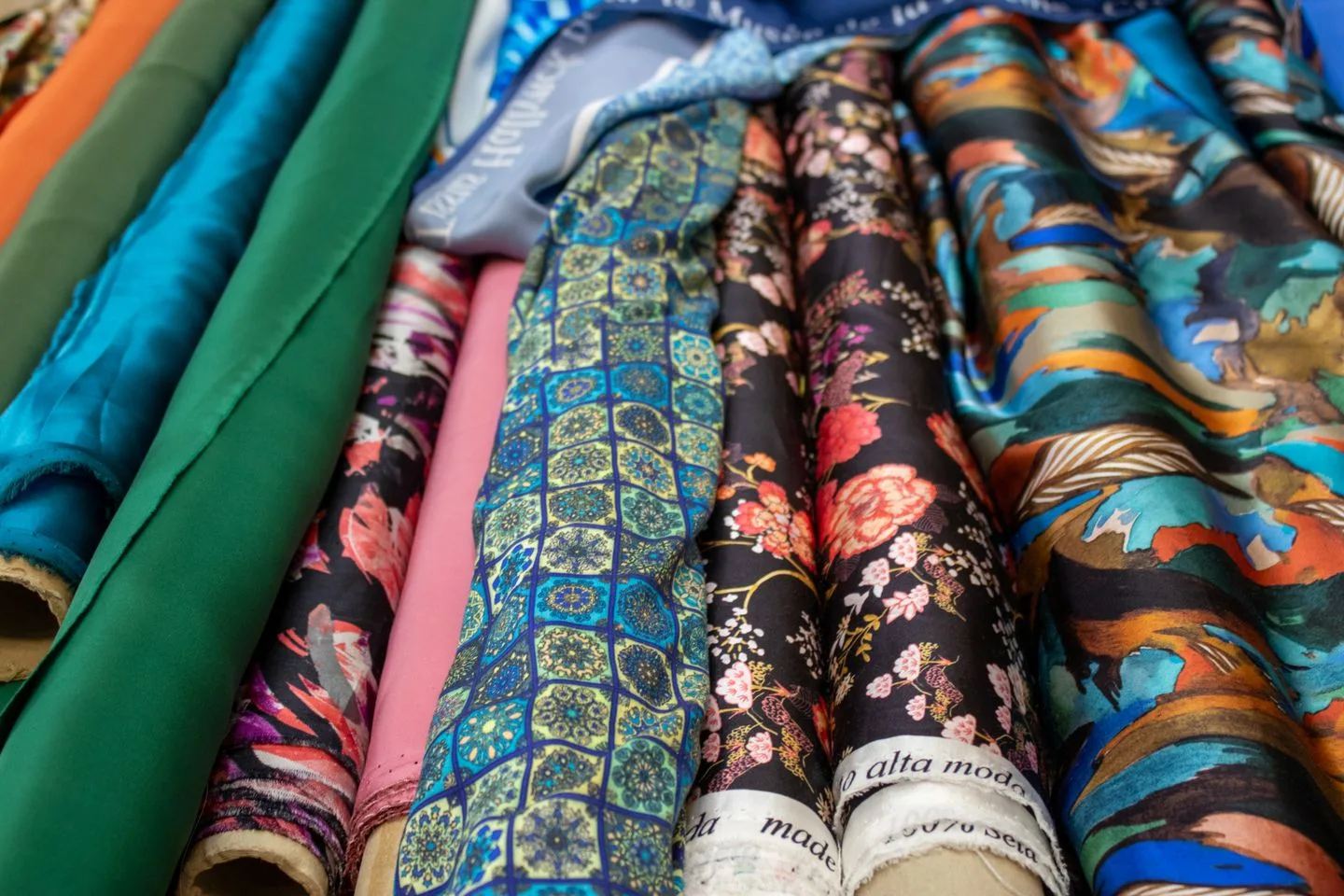
An apricot palette should be a style-color-material map, not only a row of color chips. The material contributes texture, opacity, sheen, depth, and visual temperature. The same dye direction can appear lighter on an open knit, deeper on a compact jersey, more yellow on a brushed surface, cleaner on a smooth poplin, or more reflective on a satin-like construction. A washed or printed route can add another layer of change. The buyer should therefore decide which material version is central to the collection before judging whether a color is correct.
Use a practical record such as the one below. It does not prescribe a fixed number of colorways. It simply connects the visual intention to the proof needed before the next development gate.
| Palette role | Buyer record | Factory confirmation before the next gate | | --- | --- | --- | | Core apricot body | Style-material scope, controlling reference, intended depth, quantity exposure, owner, and current status. | Which fabric proof or garment sample is needed to assess the stated shade on the intended surface. | | Softer supporting shade | Adjacent colors, silhouettes, and the difference from the core apricot. | Whether the material makes the difference visible enough to justify a separate colorway. | | Warm neutral partner | Cream, sand, brown, or other named neighbor, plus the intended balance. | How the colors read together on their selected fabrics, labels, and packing components. | | Contrast detail | Exact application such as print, piping, label, lining, or closure. | Whether the component needs an applied proof, tonal coordination, or deliberate contrast approval. | | Lab Dip or swatch | Fabric base, version, viewing notes, reviewer, and decision question. | What the proof confirms and which garment-level question remains open. | | Bulk release | Approved reference, style-color-material matrix, exceptions, and change record. | Where the reference is checked and which later change reopens the approval route. |
The fabric selection guide can help a buyer make the material conversation more specific. Review handfeel, weight, drape, opacity, stretch, texture, construction, care expectations, components, and sample evidence alongside the color direction. If a material route is still open, say so. It is safer to approve a visual direction provisionally than to imply that an undefined fabric will reproduce a particular shade.
How should buyers use visual references carefully and move quickly to physical proof?
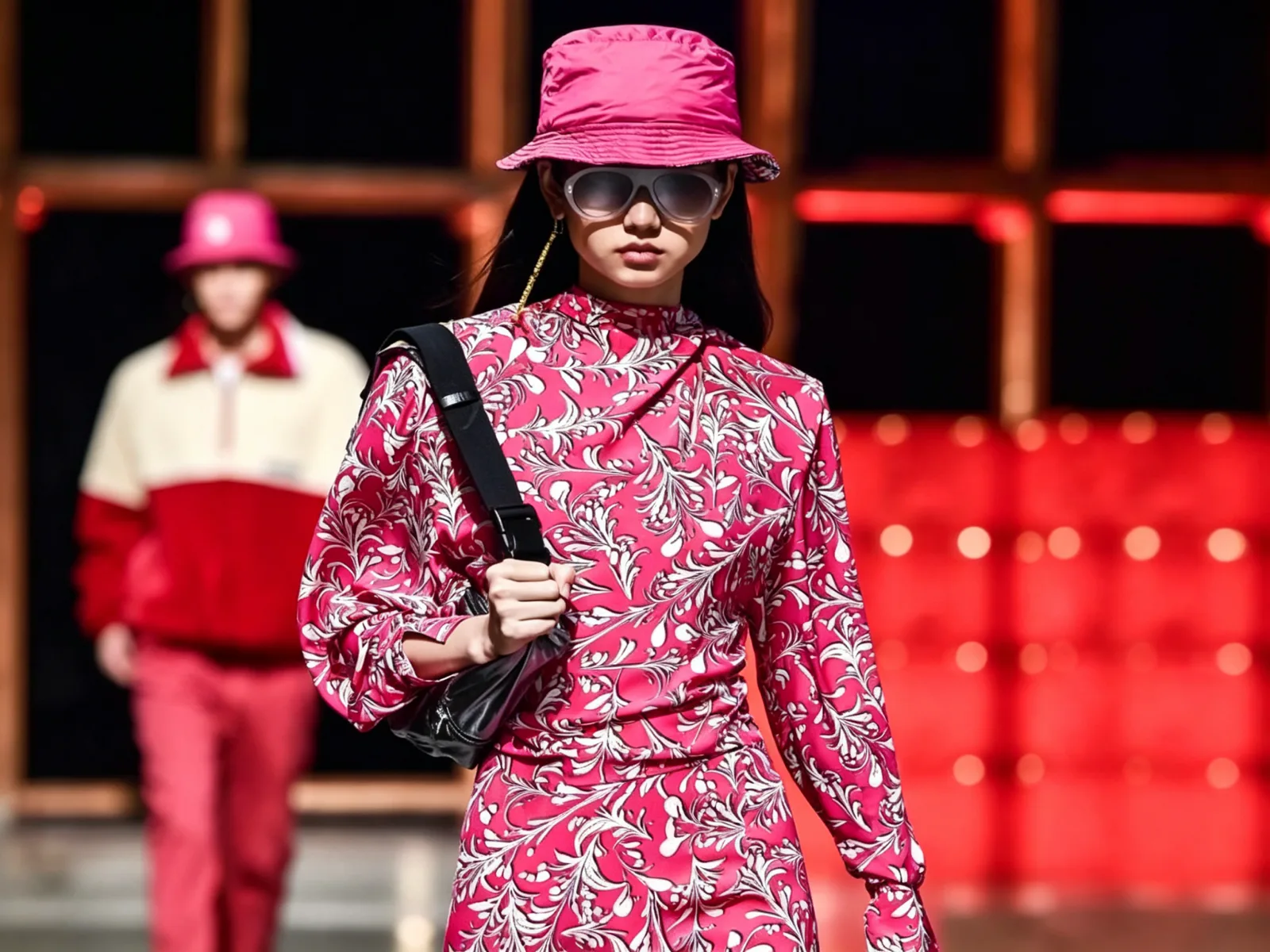
Images are useful for explaining contrast, energy, styling, and the relationship between colors. They are not automatically production standards. A garment photograph can contain a filter, a light source, a background reflection, post-processing, or a surface texture that the new product will not share. An inspiration image can still help the factory understand that the buyer wants apricot to feel dry and dusty rather than bright and glossy, or warm against a brown accessory rather than pink beside a cool grey.
This reference is used as visual direction, not as evidence of a material specification or a finished-product claim. The useful next step is to identify what aspect of the reference matters: hue, depth, undertone, matte surface, tonal layering, contrast level, or the way the color is distributed across a look. Then identify what the current product needs to prove on its own fabric, construction, and components.
Keep visual inspiration separate from approval evidence. The approval record should name the fabric base, proof version, date, reviewer, sample or swatch scope, comments, and next action. A buyer may retain a physical standard or an approved sample as the controlling reference while the mood board remains broader and more expressive. That distinction avoids a late disagreement in which one team remembers the photograph while another team followed the material proof.
When a visual reference is supplied, annotate what is fixed and what is open. For example, “maintain a muted yellow-orange direction on the body fabric; confirm the depth on the selected woven base; no approval yet for lining, thread, or label ground.” This wording gives the development team a question it can answer and prevents an image from being stretched into a claim about every part of the garment.
How should buyers select fabrics by the apricot result they need to show?
The right material depends on the product, not the color alone. A fluid woven may show apricot through folds and movement, while a structured twill may make the same direction look more solid and utilitarian. A rib can create shadow and highlight that deepen the shade. A brushed knit can soften the surface. A shiny construction may push the color toward a brighter reading. Fabric composition, yarn, construction, weight, texture, opacity, dye route, wash, and finish can all influence what the buyer sees.
Ask a focused question for each high-priority style. Is the buyer approving hue only, hue on a named base, the relationship between main fabric and rib, the result after a wash, a print over the color ground, or the full garment with lining and trims? A clear question lets the supplier recommend whether the next proof should be a swatch, Lab Dip, strike-off, applied detail, or garment sample. It also makes a returned proof easier to comment on without relying on general reactions such as “too orange.”
Review coordinated materials together when possible. Main fabric, contrast fabric, rib, lining, thread, zipper tape, elastic, drawcord, print ink, embroidery thread, label ground, and packing components can all change how the body color reads. A slightly darker zipper tape may be an intentional design decision; a body-and-rib mismatch discovered after components arrive is a different problem. State whether the relationship should be exact matching, tonal coordination, contrast, or an accepted difference.
Apricot on a pale or light-weight base may raise opacity questions that are separate from color. A buyer should identify whether coverage is important for the intended silhouette and how it will be checked on the sample. That is not a promise about material performance. It is a prompt to make the intended garment outcome visible before a bulk decision is treated as final.
What should buyers check about approve an apricot route with defined Lab Dip and sample questions?
A Lab Dip is a small dyed fabric proof used to review a proposed color on a specified material. It can be a helpful stage in apricot development because it lets the buyer compare undertone, depth, and surface appearance on the actual base before the garment team moves further. It is not the same as approving a complete garment. The record should identify the fabric base, construction or finish information available, color reference, version, date, reviewer, viewing notes, decision, and any follow-up proof.
Comments should state what needs to change. “Return one option with less yellow cast on the same fabric base,” “retain the current depth but reduce the surface shine,” or “review the body fabric beside the intended rib” are actionable comments. “Make it more premium” is not. If the buyer is comparing more than one option, name each option and the decision rule rather than relying on an email thread that later loses the physical context.
Do not stretch a Lab Dip approval beyond its scope. A garment with wash treatment, print, embroidery, lining, complex seam construction, contrast binding, or a different material surface may need a separate applied proof or full sample. The buyer can still use the Lab Dip as a controlled starting point. The record should say what it proves and what remains open, so no one treats a small fabric piece as automatic approval for every product in the range.
The fashion sample approval guide explains how to convert a garment sample into a usable reference for fabric, fit, trims, quality priorities, labels, and packing. Link the sample comments to the apricot decision record. The outcome should make clear whether the approved scope is a named swatch, one style-color-material combination, or a larger production release.
What should buyers check about pair apricot with neighboring colors through product context?
Apricot rarely needs to carry a collection alone. Its pairings should be chosen for the garments, fabric surfaces, retail presentation, and range architecture involved. Soft cream can make a muted apricot feel light and calm. Warm sand or tobacco can add depth. Deep brown can create a stronger contrast. A blue-grey may create a cooler counterpoint. A darker orange can move the range toward tonal layering. The precise result depends on the shade values and materials being compared, so the pairings should remain a development hypothesis until they are reviewed on actual components.
Begin with one color relationship at a time. Decide whether the apricot is expected to dominate, bridge, soften, or punctuate. Then state the ratio through product application: body color, contrast panel, stripe, lining, label, print ground, or merchandise grouping. A range can have an effective apricot story even when only a minority of styles use the shade on the full garment. This may be more practical for a buyer who wants a clear visual signature without requiring every fabric supplier to reproduce the same color route.
Photograph samples beside their intended neighbors, but do not let digital images become the sole approval basis. Studio light, retail light, daylight, and phone screens will present combinations differently. The physical reference should control the stated product decision. Images can document the review and help sales or marketing colleagues understand the product story, while the dated sample or approved material proof remains the evidence for development.
If the brand has a new accent or contrast color under consideration, mark it as open rather than treating the palette as final. This lets a buyer test a narrow range of options without forcing an unapproved pairing into trims, labels, or packing artwork too early.
How should buyers map apricot across categories without forcing every style into one result?
The same apricot direction can be interpreted differently across a collection. In a dress, it may emphasize drape and a smooth surface. In a blouse, it may provide a soft body color with a neutral collar or button route. In knitwear, it may become warmer through texture and shadow. In loungewear, it may need a coordinated rib, elastic, or print. In a jacket, it may be more appropriate for a lining or internal detail than for the entire shell. The category decision should come before the factory is asked to match a color everywhere.
Build a style-color-material matrix. For each style, record the material, desired apricot role, related components, visual priority, proof required, sample status, and approval owner. This record helps a buyer see whether a core shade has an unrealistic scope or whether several low-volume applications can share a more practical tonal relationship. It also keeps a color choice connected to the quantity structure, which matters when the buyer is deciding how much development work to put behind each option.
Use a sample to check relationships that a flat swatch cannot show: seam shadow, gathers, pleats, collar construction, pockets, buttons, lining, rib, print placement, embroidery, and label location. The goal is not to make every style identical. It is to decide which differences are intentional and which need another review. Record the result at the style level so a successful knitwear proof is not assumed to approve a woven dress.
This approach lets product teams extend an apricot palette without reducing it to a generic fashion statement. The result can be a coherent collection of product decisions rather than a set of unrelated garments that happen to have similar color names.
What should buyers check about coordinate trims, labels, and packing around the approved garment?
Color is carried by more than the main fabric. Thread, rib, lining, zipper tape, elastic, drawcord, buttons, snaps, print inks, embroidery threads, woven labels, printed neck labels, hangtags, stickers, poly bags, and cartons may all change how an apricot garment reads. Some components require an exact match. Others work better as a planned neutral, darker tonal element, or deliberate contrast. The buyer should identify which relationship matters for each component.
Create a component map for every high-priority style. Name the main fabric, contrast material, lining, thread, closure, decorative item, label ground, and packing component. State whether it needs exact matching, tonal coordination, a contrast direction, or a separate proof. A factory can then ask useful questions before an untested component is treated as settled. This is more reliable than asking a supplier to “make everything match” without a stated visual priority.
Private-label details should follow the same record. A woven label may read differently from a printed neck label. A warm hangtag can shift the perceived color of a muted garment in a product photograph. Product names, size stickers, barcode information, and packing references may need to use a stable color code even before the customer-facing shade name is final. The private-label development page provides a useful route for organising branding files, labels, and packing around the actual style-color-size scope.
Keep the component review proportional. A small interior label does not necessarily need the same proof route as a full contrast rib. The decision record should show where exactness matters most, where a tonal relationship is acceptable, and which components should be viewed on the actual sample before the next gate.
How should buyers plan samples and commercial terms without treating a reference as a quote?
An apricot direction should move into sampling with a stated objective. One sample may be intended to confirm silhouette and color on the selected material. Another may need to review the relationship between a body fabric, rib, lining, print, or label. A third may serve as a pre-production reference for an approved style-color-material route. State which purpose applies before the team assumes that one garment will answer every question.
Share the product brief, color reference, material direction, size, components, decoration, label files, packing needs, quantity assumptions, destination, and approval owner. Mark fixed details and open choices separately. This gives the factory a basis for identifying missing information or suggesting a proof sequence without presenting an inspirational image as a fully specified order.
Yinshan Fashion generally quotes a sample garment at two to three times the corresponding bulk garment price. For the same style, the sample charge may be refunded at 10% with an order of 100 pieces, 30% at 300 pieces, 50% at 500 pieces, and 100% at 1,000 pieces. These are reference terms for the stated style only. Confirm the current product, materials, construction, quantity, and order details before relying on them for a programme.
Keep commercial and color decisions connected but distinct. A buyer may choose to concentrate proof on the higher-priority apricot style-color-material combinations before expanding to supporting options. That can make a sampling plan easier to manage without assuming a fixed MOQ, stock position, lead time, material availability, or price. The current product information and approved scope should determine what moves forward.
What should buyers check about control shade changes before bulk production and repeat orders?
Bulk shade management is not a guarantee that every garment will look identical under every light. It is a documented way to make the controlling reference, acceptable relationship, inspection point, and escalation route visible. The exact controls depend on the product, material, color, construction, component route, and programme requirements. A buyer should ask how the reference is identified, when a comparison occurs, who records an observation, and who decides what happens if a question is found.
Keep one release pack for each approved style-color-material route. It can connect the style code, fabric and component references, approved swatch or sample, versioned comments, proof scope, construction details that affect appearance, labels, packing, quantity matrix, quality priorities, approved exceptions, and authorised changes. If a dye lot, fabric finish, component source, print, wash, or packing choice changes, the team can see whether the original approval still applies or whether the route needs to reopen.
Repeat orders deserve the same check. A previous apricot garment is useful history, but it does not automatically approve a new material, construction, quantity split, component source, label, market, or packing route. Start with the retained record and make a difference list. Identify what remains the same, what requires a current proof, and who will approve the new scope. This preserves continuity without overstating the reach of an old decision.
When a color question arises, compare the submitted piece with the controlling reference in the stated product context. Record which styles or components are affected, what the buyer and factory observed, and the agreed next step. A clear record is more useful than a verbal memory of a shade viewed weeks earlier.
What should buyers check about buyer checklist for an apricot apparel collection?
Before an apricot direction is released for development, a buyer should be able to answer these questions:
- Which styles, materials, and components use apricot, and what role does it play in the collection?
- What controls each proposed shade: a physical standard, named fabric proof, approved sample, or inspiration image that still needs confirmation?
- Which material characteristics may change the result, including texture, sheen, opacity, wash, print, lining, rib, and component relationships?
- What exact question must the next proof answer: hue, depth, undertone, surface appearance, coordination, print result, garment appearance, or bulk reference?
- Who consolidates buyer feedback, who records the factory response, and what decision status applies to each version?
- Which labels, trims, packing components, quantities, quality priorities, and approved exceptions must be linked to the release pack?
These questions do not require every creative decision to be final before a buyer speaks with a manufacturer. They make the first question specific enough for the next proof to resolve. That is the difference between a visual direction that stays on a mood board and a color route that can be sampled, discussed, and controlled with the garment.
How Yinshan Fashion can support an apricot color-development brief?
Yinshan Fashion can review an apricot color direction as part of a custom or private-label apparel development discussion. Share the product references, proposed categories, fabric direction, visual references or physical standards, style-color-material matrix, components, labels, packing needs, quantity assumptions, destination, sample purpose, approval owner, and open questions. The most useful first response may be a request for a material reference, a clearer physical standard, a component map, a quantity split, or a definition of what the first proof needs to answer.
That is practical progress, not a barrier. It gives the development team a basis for discussing fabric sourcing, samples, private-label details, quality priorities, packing, and export coordination without making an unsupported promise about a shade, material, commercial term, test, certification, availability, timing, or delivery outcome. It also makes it easier for the buyer to decide what evidence is needed before the next approval gate.
For a project-specific discussion, share your apparel product brief with the current apricot reference, fabric direction, style list, components, sample objective, quantity assumptions, and the questions you want the next proof to resolve.
Apricot development kit
Three controls that make an apricot direction usable in apparel development
Apricot becomes a reliable collection decision when the team defines its product role, proves it on the intended material, and keeps a dated record of what each approval covers.
Define the intended apricot
Record undertone, depth, surface impression, visual reference, collection role, style-material scope, owner, and the exact question that the next proof must answer.
Review it on the garment route
Assess the color on the intended fabric and finish, then beside the rib, lining, thread, closure, print, label, or packing component that changes the result.
Release a traceable approval
Keep the approved reference, proof version, style-color-material scope, comments, components, exceptions, and authorised changes together before a bulk decision.
Buyer action and factory confirmation before an apricot color route moves forward
Use a dated record to connect the visual reference, material route, color proof, samples, components, private-label details, packing, quantity assumptions, and approval scope. Material availability, commercial terms, tests, approvals, and timing remain programme-specific.
| Decision area | What the buyer should prepare | What to ask the factory |
|---|---|---|
| Color direction and collection role | State undertone, depth, saturation, visual role, style-material scope, adjacent colors, fixed decisions, owner, and questions that still need a proof. | Which reference controls the current discussion, which styles carry the greatest exposure, and which color question should be reviewed first? |
| Controlling reference | Share the physical standard, retained garment, swatch, visual image, working color code, date, and the specific result each source is meant to communicate. | What information is missing from the current reference, and what material-specific proof is needed before a product approval? |
| Fabric and surface appearance | State the selected material or open material direction, construction, finish, texture, sheen, opacity, wash, print, lining, rib, and component relationships. | What can be assessed from the reference, and does the current route need a swatch, Lab Dip, applied proof, or garment sample? |
| Lab Dip and garment sample scope | Name the fabric base, color version, reviewer, viewing notes, decision wording, sample objective, and the product question that remains after each proof. | What does this proof confirm, what remains open, and which style, wash, print, construction, or component must be carried to the next gate? |
| Trims, labels, and packing | Map thread, closures, elastic, decoration, labels, hangtags, stickers, and packing components to each style and the intended color relationship. | Which item needs exact matching, tonal coordination, deliberate contrast, a separate proof, or a buyer decision before it is used? |
| Bulk release and repeat control | Retain the approved reference, material route, sample evidence, component decisions, quality priorities, exceptions, quantity matrix, product data, packing record, and authorised changes. | How is the current reference identified, where is a color question reviewed, and which later change reopens the approved route? |
Continue the production conversation
Apricot apparel development: color role and proof record
| Development point | Buyer record | Factory question before moving forward |
|---|---|---|
| Apricot direction | Undertone, depth, saturation, visual reference, product role, owner, and status. | Which reference controls the current discussion and which visual material proof is needed next? |
| Style-material map | Style, fabric route, intended surface, component relationships, quantity exposure, and sample purpose. | How does the selected material affect the proposed color, and which styles need separate proof? |
| Lab Dip or swatch | Fabric base, version, viewing notes, reviewer, decision, and the question the proof is intended to answer. | What does the proof confirm, and what must still be checked on a garment or applied component? |
| Color pairing | Adjacent colors, intended balance, application ratio, and product context. | Should the relationship be reviewed on body fabrics, rib, lining, print, labels, or retail presentation? |
| Components and packing | Thread, closures, trims, labels, hangtags, stickers, and packing relationship for each style. | Which items need exact match, tonal coordination, deliberate contrast, or a separate proof? |
| Bulk and repeat release | Approved reference, style-color-material scope, exceptions, change log, and quality priorities. | Where is the reference checked, who records a question, and which change reopens the approved route? |
Buyer FAQs
What is an apricot color fashion trend in apparel development?
For an apparel brand, an apricot color fashion trend becomes useful when it is defined as a product decision: the intended undertone and depth, style-material scope, collection role, controlling reference, proof route, component relationships, and approval owner. An inspiration image can set direction, but a fabric proof or sample should define the approved scope.
Which fabrics can change how apricot appears?
Construction, fibre blend, yarn, weight, texture, opacity, sheen, dye route, wash, print, and finish can alter an apricot result. Review the shade on the intended material and beside relevant rib, lining, thread, zipper tape, labels, or print rather than relying on a flat color chip alone.
Is a Lab Dip enough to approve an apricot garment color?
A Lab Dip can answer a defined color question on a named fabric base. It may not answer garment-level questions about wash, print, embroidery, lining, texture, construction, or adjacent components. Keep the proof scope in the record and use an applied proof or garment sample where the product requires it.
How should a brand pair apricot with other colors?
Start with the color's job in the range and the products that will carry it. Record the adjacent shades, application ratio, material surfaces, and components that need review. Approve the physical color relationship on the relevant garment and components rather than assuming a digital mood board controls every production decision.
How does Yinshan Fashion handle samples for an apricot collection?
Yinshan Fashion generally quotes a sample garment at two to three times the corresponding bulk garment price. For the same style, sample charges may be refunded at 10% for 100 pieces, 30% for 300 pieces, 50% for 500 pieces, and 100% for 1,000 pieces. Confirm the current product, material, construction, quantity, and order details before relying on these reference terms.