
Article
What should buyers know first?
Short answer: Use 2026–2027 fashion colour trends as a buyer planning tool: build a balanced palette, verify fabric colour, control samples, quantities, trims, packing, and bulk handover.
How should a brand use fashion clothing color trends 2026 2027?
Fashion clothing color trends 2026 2027 are most useful when a brand treats them as a planning input, not as a ready-made commercial answer. A trend report can help a buyer frame a colour direction, but it cannot confirm which shade will sell, how it will look on a chosen fabric, whether it can match across components, or what the current programme will cost. Those decisions still depend on the customer, category, channel, fabric base, quantity structure, brand identity, market, and approval route.
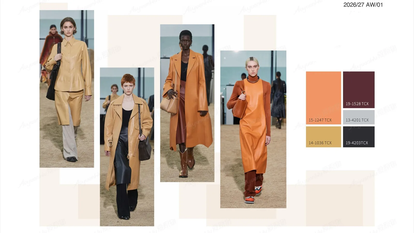
For example, Pantone's New York Fashion Week Autumn/Winter 2026/2027 report places earthy tones, neutrals, greens, blues, and vivid accents in the same seasonal conversation. Its published colours include Muted Clay, Neptune Green, Green Envy, Arabian Spice, Foxglove, Festival Fuchsia, Red Mahogany, Acacia, All Aboard, Burnt Olive, and a seasonless group that includes Egret, Candied Ginger, Toffee, Underworld, and Poseidon. That is a useful reference set. It is not a guarantee that every colour belongs in every collection or that a named shade will reproduce identically on every material.
The practical buyer question is therefore not “Which colour is trending?” It is “Which colour role supports this product and what evidence is needed before it becomes a bulk instruction?” Yinshan Fashion works on custom and private-label bulk programmes rather than unrestricted ready-stock wholesale. Exact material availability, colour route, sample needs, commercial terms, testing, quantities, timing, and market suitability must be confirmed for the current product.
How should buyers start with a customer and product decision, not a colour board?
Before choosing a palette, describe the commercial situation. Is the product a core casual piece, a controlled seasonal drop, an active layer, a streetwear statement, a loungewear set, or a boutique edit? Who will wear it, where will it be sold, and what is the range meant to help the brand learn or achieve? A colour that is compelling in a campaign image may add unnecessary development work if the first objective is a repeatable core style. A quiet neutral may be more useful for a shared fabric programme, while a vivid accent may work better as a limited colourway, print detail, lining, binding, or accessory.
Put the target customer, channel, destination, product category, intended use, launch context, and palette decision owner at the top of the brief. Then state whether the colour is expected to be a core, seasonal, accent, or test colour. This turns a visual preference into a question the buyer and factory can work with. It also prevents a supplier from treating a mood-board image as an approved manufacturing specification.
For a casual fashion collection, a buyer might use a grounded neutral as a carrying colour and reserve one high-energy colour for a specific garment or detail. For an active fashion collection, the same visual direction needs to be tested against stretch, recovery, opacity, surface sheen, contrast panels, and the appearance of applied components. The category page is a useful starting point; the actual garment, fabric, and retail route still need their own record.
How should buyers translate a trend report into colour roles?
Reports are easier to use when a buyer assigns roles rather than copying a list of names. Start with a small, visible palette architecture. A practical first draft could include a base neutral, a supporting neutral or dark, one principal colour, one secondary colour, and an optional accent. The number is not a rule. It is a way to expose how many fabric, trim, sample, SKU, photography, and packing decisions the collection is introducing.
Pantone's Spring/Summer 2026 New York Fashion Week report also presents both expressive and trans-seasonal directions: its seasonless group includes Coffee Bean, White Onyx, Rhodonite, Angora, Sycamore, and Sage Green. Together with the later Autumn/Winter reference, this can help a buyer consider a range that has continuity without claiming that a single forecast determines the next selling season. Use the official colour names only as reference language. Record the actual physical standard, swatch, code, or approved sample that the programme will use.
A role-based structure makes decisions clearer:
- A base colour carries the largest share of a range and may need to work across more than one style.
- A supporting colour gives contrast, depth, or outfit-building options without duplicating the base.
- A principal colour expresses the collection's immediate direction and should be mapped to the garments where it earns its extra complexity.
- An accent colour is deliberately limited: it may appear on a binding, graphic, lining, accessory, label detail, or selected colourway.
Do not assume that a colour name creates a colour specification. “Olive”, “navy”, “clay”, “fuchsia”, “white”, and “blue” can mean very different physical results. A named source, date, owner, intended fabric base, and approval status are more useful than an unlabelled screen capture.
How should buyers choose colour by fabric behaviour and garment function?
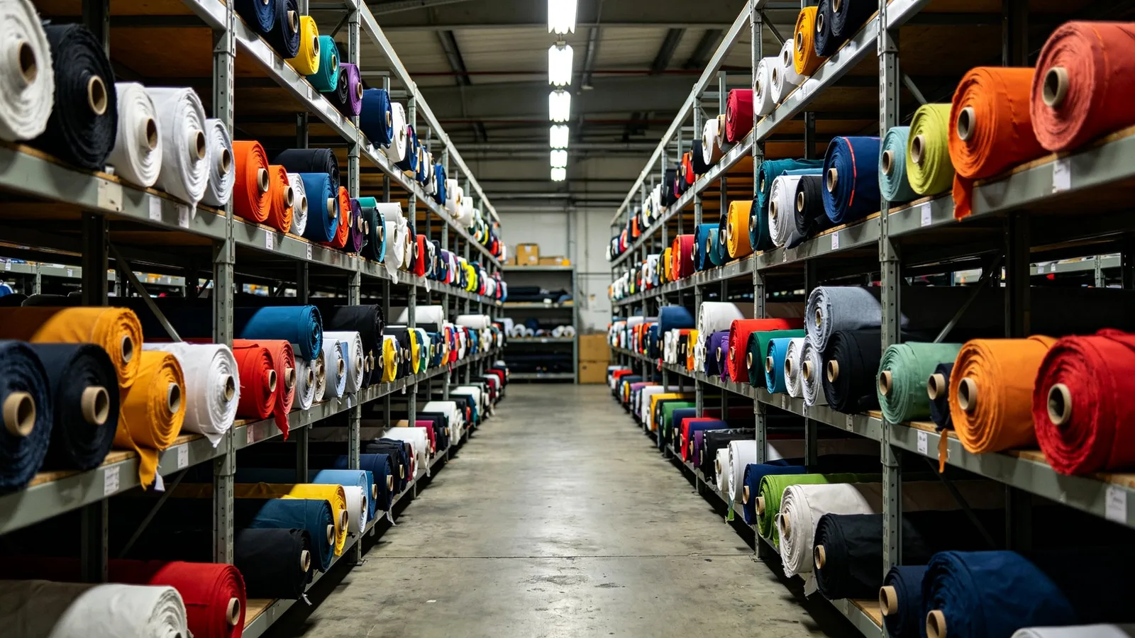
The same colour direction can look different on cotton jersey, brushed fleece, woven poplin, rib, knit, coated fabric, lining, elastic, thread, print, embroidery, labels, and packaging. Fibre, construction, weight, surface, finish, dye route, and lighting all influence what the eye sees. A deep blue that looks calm on a matte woven may appear brighter on a smooth synthetic surface. A light neutral may need a separate review for coverage, lining, or product photography. A strong accent can affect the perceived quality of a zip tape, print edge, or branded label even when the main garment looks correct.
Begin with the garment outcome rather than a generic fabric name. For each style, note handfeel, drape, stretch, recovery, opacity, surface, finish direction, care expectation, use, and the colour role it needs to carry. Then connect the proposed fabric reference and colour reference to that style. The fabrics and trims resource can help organise material and component questions, but it does not replace the product-specific evidence that the buyer must review.
When one shade is expected to appear on several bases, list every base separately. A buyer can decide whether close matching is essential across the shell, lining, rib, elastic, thread, label, and packaging, or whether a controlled tonal relationship is acceptable. That decision should be visible before sampling. It is much safer than asking a factory to “make everything the same” without defining the evidence or tolerance for the product.

How should buyers build one colour record for every proposed colourway?
A colour direction becomes usable when it can be traced. Give every style-colour combination a code and record the current product version. The file can be a colour sheet, a column in a product matrix, or part of a tech pack. What matters is that the buyer, designer, product developer, factory, and retailer are looking at the same current instruction.
For each proposed colourway, record the style code, colour role, source reference, actual or proposed fabric base, components that must relate to it, intended channel, quantity assumption, sample status, approver, decision date, and open question. If a buyer has a preferred shade and an acceptable substitute, make that distinction explicit. If only a screen reference exists, state that physical review is pending. A file name such as “final green v3” is not enough when several greens, fabrics, and garment versions are in circulation.
Add a version date to colour cards, artwork, sample comments, and quantity matrices. When a colour is revised, identify the affected style, fabric, trim, label, print, packing item, and order line. This is especially important when a colourway has been removed, a component uses a different base, or a retail team has already created product imagery or barcode data. A concise change log stops an old visual direction from quietly becoming a bulk instruction.
How should buyers review physical evidence before a colour is approved?
Digital references are useful for discussion, but they should not be the only approval evidence for a production colour. Screens vary. Photography, background, editing, and viewing light also change perception. A physical swatch, material header, strike-off, lab dip, component proof, or garment sample may answer different questions depending on the product. The buyer and factory should agree which evidence is needed for the current decision and what it does not yet approve.
For a new fabric route, a buyer may first review a swatch or header for handfeel and general direction. If colour is critical, a physical colour proof may be needed before the garment sample. The garment sample can then reveal how the shade works with silhouette, construction, opacity, seams, components, labels, and photography. Treat each step as evidence for a named question. Do not let a sample approved for fit automatically authorise a colour, trim, label, or packing route that was not present or not reviewed.
Keep comments consolidated against the actual sample version. A useful comment says what changes, what remains open, who can approve the next step, and which reference supersedes the previous one. “Looks good” is not a colour instruction. “Approve colour on shell fabric for style CF-02; rib and print proof remain open” is a clearer project record.
How should buyers plan colour quantity at style, colour, and size level?
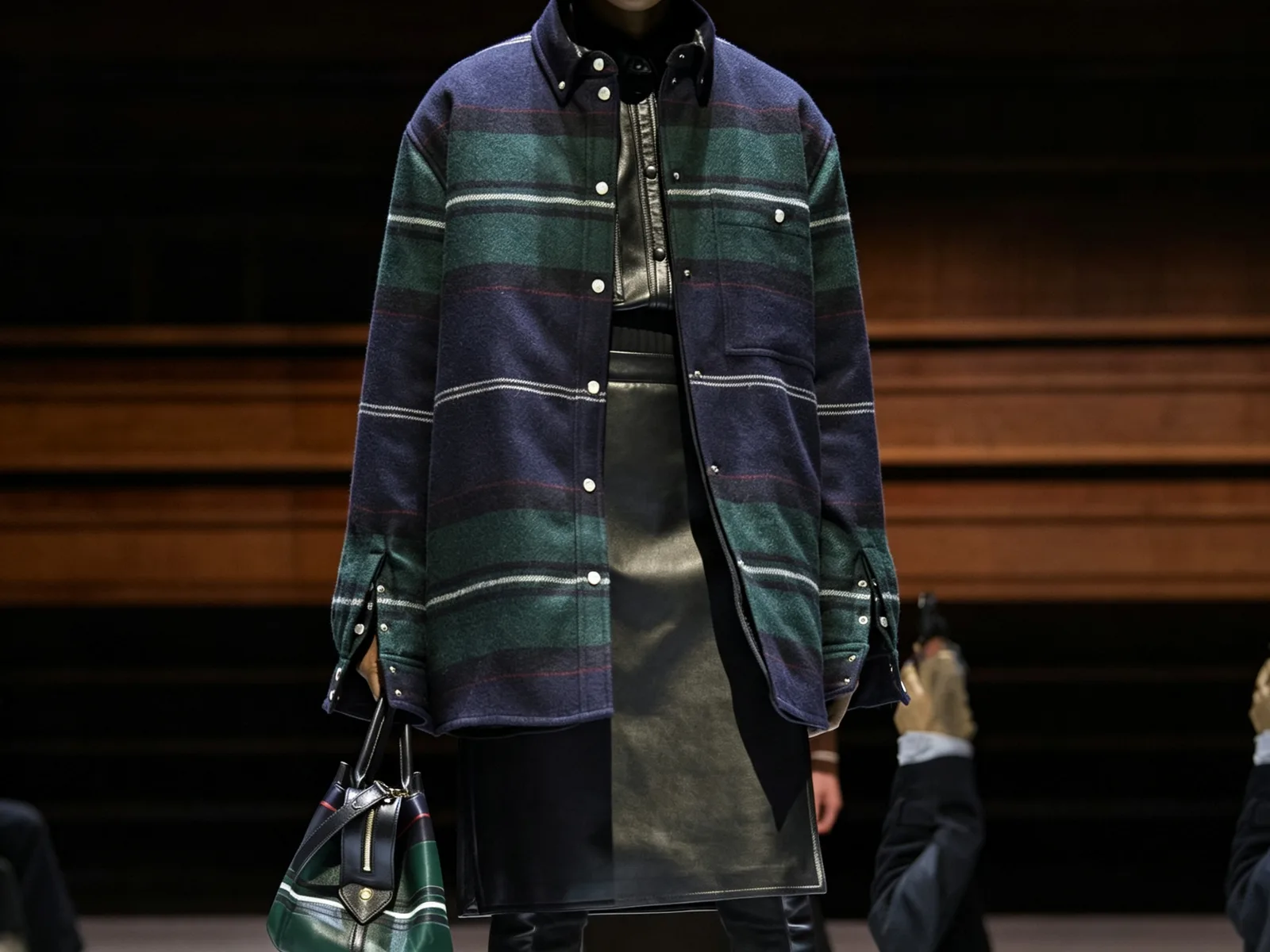
A total order number does not show the real colour decision. A factory needs the current quantity by style, colour, and size where relevant, plus fabric count, trims, decoration, label package, packing variation, destination, and channel. Mark estimates as estimates, and name the next decision date. This does not lock a buyer into an order; it makes the current discussion honest.
Every added colourway can introduce a split in fabric, dyeing or purchasing discussion, components, labels, sample work, photography, product data, packing, and replenishment. The exact impact depends on the product and current programme, so a trend-led choice should be reviewed alongside the quantity matrix rather than separated from it. A buyer may decide to keep a statement shade on a single hero style, use a neutral across compatible pieces, postpone a lower-priority colour, or test a colour only after the core route is clearer.
Ask for assumptions, inclusions, exclusions, and questions to be stated beside the current quantity matrix. The fashion clothing MOQ, sample cost, and bulk price guide explains why a comparable discussion needs the same product basis. It should not be read as a fixed price, MOQ, or sample-term promise. A final commercial route depends on the actual garment, materials, components, quantities, and approvals.
How should buyers connect colours to trims, branding, and packing?
Colour rarely stops at the garment shell. Thread, buttons, zips, drawcords, elastic, patches, embroidery, prints, labels, hangtags, barcode stickers, polybags, tissue, carton marks, and retail inserts can all need a colour, contrast, or version decision. A garment may have an approved body fabric while the thread, print, or label remains open. If this is not recorded, an early visual preference can be mistaken for a complete component instruction.
Create a component list that maps each item to its style, colourway, placement, source, artwork or copy version, finish, owner, approval status, and packing use. The custom labels, trims, and packaging guide helps structure this record. The buyer should provide and approve final consumer-facing content, barcode sources, and destination-specific requirements; a factory should not infer these from a mood board or a general trend reference.
For a light base colour, consider whether individual protection, folding boards, stickers, or print placement need a separate visual review. For a saturated colour, check whether contrast components, label legibility, packing scuffing risk, or product photography require a decision. These are product questions, not universal colour rules. The aim is to make the relevant risk visible before components are purchased, applied, or packed.
How should buyers use a sample sequence that answers the largest risk first?
Do not sample every colourway without a question. Identify the product uncertainty with the greatest effect on the range: a shared base fabric, a critical light shade, a dark colour on a potentially variable surface, an engineered stripe, a contrast panel, a print, embroidery, special trim, or retail presentation. State the sample purpose, version, material and component references, measurement basis, reviewer, feedback date, and next decision gate.
One sample can validate silhouette and fit while another validates colour on the final fabric. A component proof can validate thread or label contrast without proving the garment. A finished sample with provisional packing can still need a later packing review. Sequence the work so that the buyer learns the highest-value information early, then carries the approved scope into the next record. This avoids creating several attractive samples that do not answer the decision needed for a quotation or bulk handover.
The fashion product brief before sampling offers a useful structure for the handoff. Keep its colour, material, component, and quantity fields current whenever a trend direction changes. A revised shade may also reopen a fabric reference, decoration proof, label contrast, product image, packing instruction, and quantity split.
How should buyers keep quality and colour checks product-specific?
Colour quality is not one universal yes-or-no test. The right review depends on the product, fibre, colour, use, customer expectation, destination, and agreed programme. A brand may need to discuss appearance under agreed viewing conditions, shade consistency, rub or transfer risk, wash or perspiration colourfastness, print or embroidery appearance, contrast components, and the evidence required for its market. The buyer should identify the priority and any required method or standard; the factory can then confirm which material, sample, test, proof, or checkpoint is relevant before bulk.
For instance, colourfastness-to-perspiration and colour transfer by rubbing are separate technical questions in AATCC methods. Mentioning a method does not prove that a garment has passed it. The test method, sample, requirement, laboratory route, acceptance criteria, and applicability must be agreed for the current product and market. Keep the approved reference and any agreed exception linked to the precise style-colour-size order line.
During production planning, describe what the team should compare against: approved fabric or garment reference, component proof, sample comments, measurements, visual priority, and packing record. The manufacturing process provides a high-level view of how material review, production, quality checks, finishing, and packing connect. Exact checks, timing, and release criteria stay product- and programme-specific.
How should buyers make colour visible in product photography and ecommerce records?
Colour choices can become harder to control once a collection moves from development into product photography, ecommerce setup, wholesale line sheets, or retailer data. A buyer may approve a physical garment but still need to decide how its colour name, swatch image, product image, colour code, SKU, barcode, size options, copy, and collection grouping will appear to the customer or receiving team. These records do not alter the physical colour, but they shape whether the retail team is talking about the same product as the factory.
Give the ecommerce or sales team the approved colour name and product code, the current sample or image reference, the date, the affected style-colour-size scope, and a clear note if photography is illustrative rather than a final colour approval. Do not label a shade with an unapproved marketing claim or change a product name without showing the factory and warehouse which order line it represents. If two shades are intentionally close, make the distinction legible in the internal product record before barcodes, hangtags, or listings are created.
The same care applies to lookbooks and campaign direction. A seasonal palette can provide a coherent visual story, yet every garment must remain traceable to the fabric and colour reference actually approved for that item. A post-production colour adjustment, a different lighting set-up, or a mixed-fabric outfit image can be useful for creative presentation; it is not evidence that all visible components match the original sample. Keep the sales and content teams connected to the dated product record, especially when a buyer is carrying a palette across casual, active, or accessory categories.
How should buyers retain the colour decision for the next order conversation?
The first colour route is valuable only if the evidence survives the season. Retain the approved sample or physical reference where practical, fabric and component identifiers, colour card, sample comments, artwork proofs, label and packing records, quantity structure, quality observations, exceptions, and every authorised change. Link these items to the exact style and colourway rather than a broad collection title. A later team should be able to see what was approved, what was substituted, and what needs review again.
That record does not make a repeat automatic. Materials, colour availability, components, quantities, market needs, test requirements, customer preference, and timing can change. It gives the buyer a better starting point: the next conversation can begin with an identified product and a difference list rather than a memory of a season's mood board. If a shade is being renewed, ask whether the original fabric, finish, component route, packaging, quantity split, and approval evidence still apply. If not, state the next physical evidence gate before a previous result is treated as current.
How should buyers write a colour-aware RFQ and handover?
When requesting a quotation or development discussion, send one dated set of references. It should include the product image or tech pack, category and construction, fit direction, fabric behaviour, colour roles, physical references or source codes, acceptable alternatives, component plan, quantities by style-colour-size, labels, packing, destination, sample purpose, target arrival context, decision owners, and open questions. Ask the factory to identify what is assumed, what needs evidence, what is included or excluded, and which change would require a revised conversation.
Before a bulk step or another irreversible action, consolidate the approved product reference, pattern or measurement basis, material and colour route, trims, artwork, labels, packing, quantity matrix, quality priorities, exceptions, and change log into one handover. Use a version, date, and owner. “Approved for shell colour on sample version 2, subject to final print proof” is more useful than “green approved” because it identifies the scope.
The purpose is not to make a trend forecast sound certain. It is to give a brand a practical route from an inspiring colour direction to a reviewable product, a controlled sample, and a clearer factory conversation. To begin, send the product reference or tech pack, category and construction, fabric and colour direction, quantities, branding, packing, destination, sample objective, target arrival context, and unresolved points through the contact page. Yinshan Fashion can then discuss the next product-specific evidence gate with the buyer.
Colour planning kit
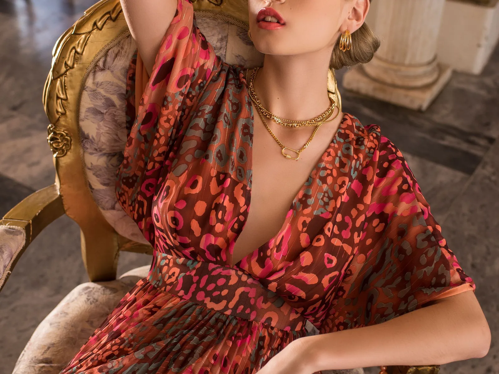
Three controls that turn a colour trend into a usable factory decision
A colour direction becomes workable when its product role, physical evidence, and change scope are visible. These controls help a buyer move from a trend reference to a sample and bulk handover without treating an early visual choice as a finished instruction.
Control the palette role
Classify each colour as base, supporting, principal, accent, or test; map it to the specific styles, customer use, channel, and decision it is meant to support.
Control the physical proof
Name the source reference, fabric base, component relationship, swatch, proof, sample, reviewer, and the exact question each piece of evidence answers.
Control the change record
Give colour cards, sample comments, components, packing, and quantity matrices one version, owner, date, approved scope, and visible next gate.
Buyer action and factory confirmation before a colour-led collection release
Use one dated checklist to connect trend direction with fabrics, components, samples, quantities, quality priorities, and packing. Exact commercial terms, availability, testing, approvals, and timing remain specific to the current programme.
| Decision area | What the buyer should prepare | What to ask the factory |
|---|---|---|
| Customer product and palette role | Provide the target customer, category, channel, destination, range purpose, launch context, and whether each colour is core, seasonal, accent, or test. | Does the current colour direction explain the intended garment role and the product decision that must be tested before the next stage? |
| Fabric appearance and colour source | Share the fabric reference, desired handfeel, drape, stretch, opacity, surface, finish, colour source, component relationships, and acceptable alternatives. | Which fabric base, finish, lining, trim, thread, print, or garment needs a distinct colour review rather than a general visual direction? |
| Evidence sample and approval scope | Name the swatch, header, colour proof, sample version, purpose, reviewer, decision owner, approval statement, and outstanding condition. | What does the available evidence confirm now, what remains open, and which physical proof or revised sample is required next? |
| Style colour size quantities | Provide the current quantity matrix, fabric count, components, labels, packing variations, channel, destination, and all provisional assumptions. | Which quantity or product split changes the current material, component, sample, or commercial discussion and needs a clear assumption? |
| Components retail and packing record | Map trims, artwork, labels, barcodes, individual presentation, cartons, product data, and source files to every applicable style-colour-size route. | Which contrast, legibility, colour, version, source, or packing proof needs buyer approval before components are applied or goods are packed? |
| Quality priority and bulk handover | State the product-specific colour or visual priority, required method where relevant, approved reference, exceptions, release owner, and retained record for repeat review. | How will the approved colour route and exceptions connect to material review, production checks, corrections, finishing, packing, and release? |
Continue the production conversation
Fashion colour planning: buyer inputs and factory confirmation
| Colour decision | What the buyer should prepare | What the factory should confirm before the next gate |
|---|---|---|
| Collection role and customer | Target customer, product category, channel, market, launch context, palette role, and fixed versus open decisions. | Which colour role suits the current product route, and which direction still needs a clearer brief or physical evidence? |
| Fabric and garment appearance | Desired handfeel, drape, stretch, opacity, surface, finish, use, fabric reference, and colour source for every style. | Which fabric base, construction, lining, component, or garment sample needs separate colour review? |
| Physical evidence and approval | Swatch, header, colour proof, sample purpose, version, reviewer, acceptance question, and approval owner. | What does the current evidence approve, what remains conditional, and what reference supersedes the earlier one? |
| Quantity and commercial basis | Current quantities by style-colour-size, fabric count, components, labels, packing, destination, and provisional assumptions. | What is included, excluded, conditional, or likely to need another product-specific commercial discussion? |
| Trims branding and packing | Thread, zips, labels, artwork, prints, barcodes, individual presentation, cartons, channel, and destination records. | Which component or packing proof needs a colour, contrast, legibility, source, or version decision before use? |
| Quality and bulk handover | Priority visual or colour risks, agreed evidence, required method where relevant, approved reference, exceptions, and release owner. | How will the current record reach material review, production checks, finishing, packing, corrections, and release? |
Buyer FAQs
What are the fashion clothing color trends 2026 2027 for brand buyers?
A buyer can use published 2026 and 2027 fashion colour references to frame a palette, but a trend list is not a sales forecast or a production specification. Start with the customer, category, channel, fabric, colour role, quantity matrix, and physical evidence needed before a shade becomes a current product instruction.
Can a Pantone trend colour be used directly for bulk clothing production?
Use the published name or standard as a reference point, then confirm the actual fabric base, component relationships, physical colour evidence, sample purpose, approval scope, and buyer requirements for the programme. The same colour direction can appear differently across fabrics, finishes, trims, and viewing conditions.
How many colours should a first fashion collection use?
There is no universal number. Start with only the colours needed for the collection purpose, then review the fabric, sample, component, quantity, SKU, photography, packing, and approval complexity created by each colourway. A smaller connected palette is often easier to assess than several unrelated directions.
When should colour be approved during clothing sampling?
Approve colour against the evidence agreed for the specific question. A swatch or header may support an early material review, while a garment sample can show colour with silhouette, construction, components, labels, and photography. Record exactly what each approval covers and what remains open.
What should a factory receive for a colour-led fashion quote?
Send a dated product brief or tech pack, fabric behaviour, colour roles and references, acceptable alternatives, components, quantities by style-colour-size, labels, packing, destination, sample purpose, timing context, approval owner, and open questions. Ask the factory to state assumptions, inclusions, exclusions, and the next evidence needed.